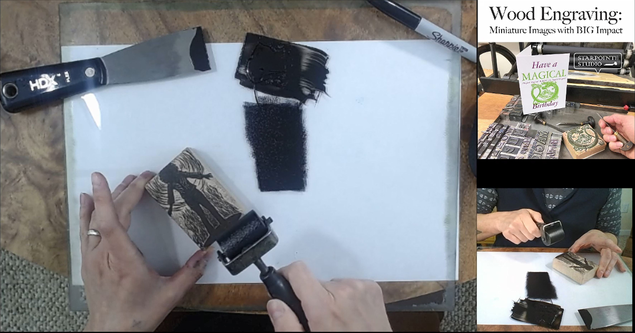
From a pre-recorded printing demo produced specifically for this workshop. (Joanne Price)
Thurs. Oct. 29–Nov. 4 | This workshop was well-organized, with the material list sent well in advance and some materials were sent to participants directly from Joanne Price, including one 1″ × 3″ practice and one 2″ × 3″ wood engraving block, a small amount of rubber-based ink wrapped in tin foil, thin print paper, and transfer paper. [Read more]
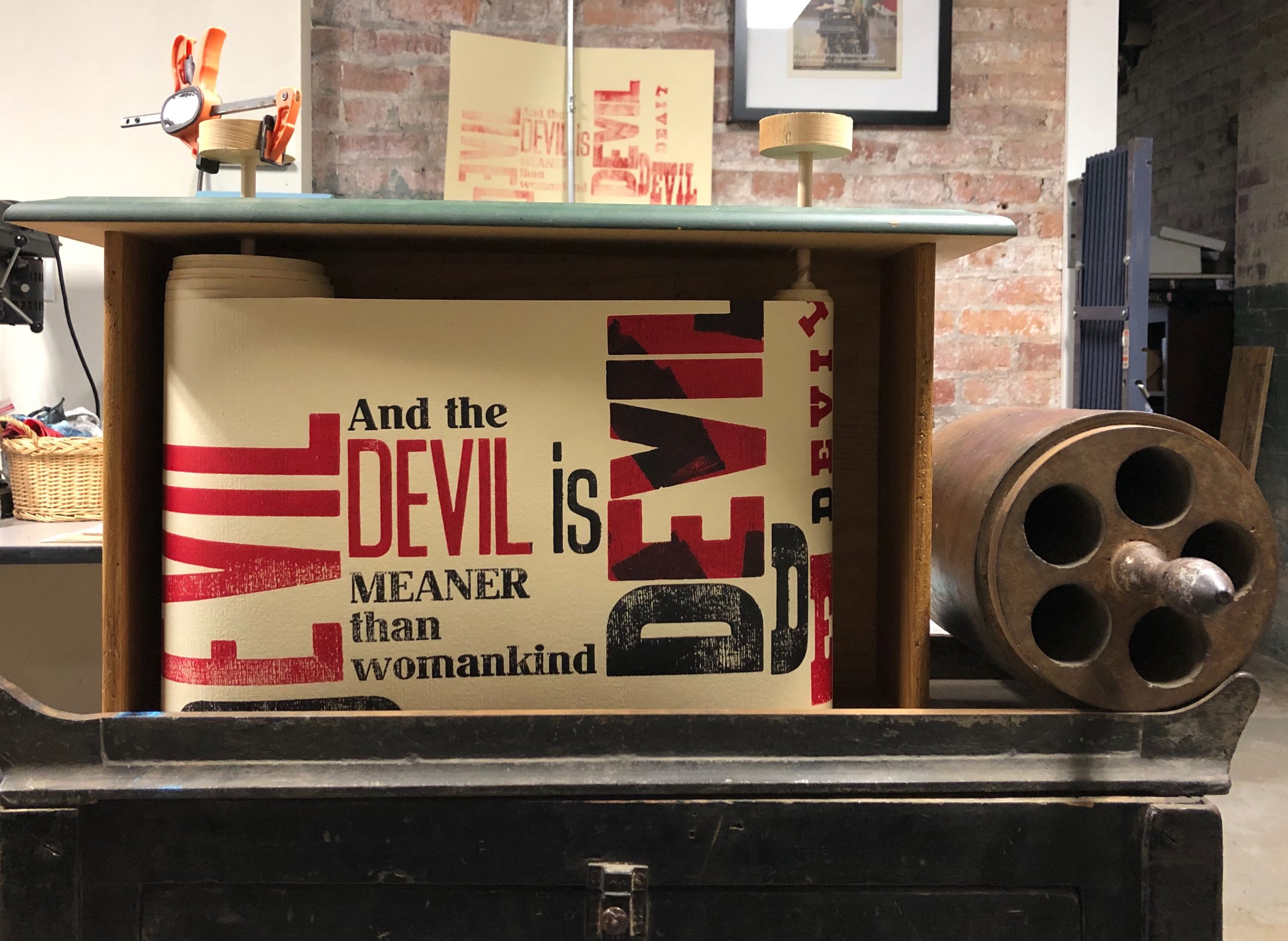
Letterpress Cranky: The Devil’s 9 Questions. This is a typographic interpretation of the Texas Gladden ballad: “The Devil’s 9 Questions.”
Fri, Nov. 6 | Catherine Schrenker’s irresistibly-titled talk involved “crankies” (or “krankies”)—either way, I was hooked from the start. Her work in the Burke Print Shop at The Wayne C. Henderson School of Appalachian Arts in Marion, Virginia is where she teaches, paints, and prints. It’s what led her to make crankies. [Read more]
Details from “Through This Lens: Composing The Source” [top] and “UNI Combining Form” [bottom], 2018. A mutually dependent 460-page introductory student project by first-semester graphic design students, developed and led by Chioffi and McMahon, at the School of Art, University of Arkansas.
Sun, Nov. 8 | This Sunday-afternoon panel discussion focused on two student projects involving experimental typography, the role of collaboration in artist books, and the work of the artist Lesley Dill. [Read more]
Georgianne Liesch and Jennifer Anne at the Pantograph with finished type. (Michael Ditmer)
Fri., Nov. 6 | George, Jennifer, and David gave an in-depth overview of the process of making wood type at the Hamilton Wood Type Museum. George, whose father ran the type shop at Hamilton and owned his own printing business, now works with apprentice Jennifer to keep the traditional techniques alive. [Read more]
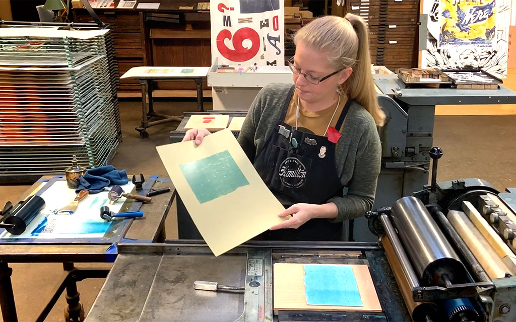
Stephanie Carpenter at the Press (Stephanie Carpenter/David Carpenter)
Sun, Nov. 8 | Stephanie Carpenter, the Program Officer at the Hamilton Wood Type Museum, and one of the hosts of the Awayzgoose presented a variety of techniques for printing during a 45-minute demonstration. Stephanie began her demo by sharing her process for working with wood type by creating a poster with the museum’s slogan of “Visit, Learn, Print, Repeat.” [Read more]
Modus System, character proof (Cooper + Hutchinson)
Thurs. Oct. 29 | Alexander Cooper and Tim Hutchinson introduced participants to Understanding Molecular Typography, a textbook that explores the atomic composition of letterforms. The book is a prank, an “elaborate work of non-narrative fiction” by the book artist Woody Leslie, but the conceit, letters as organic molecules, is worth some thought, and it inspired Alex and Tim to create the MODUS Type System. [Read more]
Sun, Nov. 8 | Bruce Licher is a deservedly-revered and influential printer/designer/artist/musician whose book, Savage Impressions: An Aesthetic Expedition Through the Archives of Independent Projects Records & Press, was released earlier this year by P22 Type Foundry. [Read more]
RIT Cary Graphic Arts Hebrew Wood Type Collection. (Amelia Hugill-Fontanel)
Sat., Nov. 7 | Shani Avni’s talk on Hebrew wood type was filled with so much interesting information that I realized while going through my many pages of notes that there is no way to recap everything. Avni is currently undertaking the cataloging of around 40 fonts of Hebrew wood type in the Cary Graphic Arts Collection at R.I.T. These fonts were acquired in 2014 from the artist Richard Rockford. [Read more]
Where Today Meets Tomorrow: Eero Saarinen and the General Motors Technical Center by Susan Skarsgard. Princeton Architectural Press, 2019 (James Haefner)
Fri., Nov. 6. | Susan Skarsgard surprised me with her story about designing nameplates and emblems for a big car company—how could working for General Motors be interesting? Her unlikely and mundane beginnings as a hospital ward clerk led her to study calligraphy with Friedrich Neugebauer, who showed her how an artist lived and whose “mystic art of written forms” inspired and changed her. [Read more]
A section of the former Hamilton factory featuring the Hamilton logo mark on which the Hamilton Script font is based. (Ann Sandler/Font Diner)
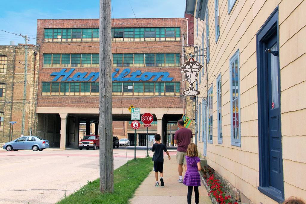
Sun, Nov. 8 | On a hot day in August 2011—under the slim shadow of a Sundae sign in Two Rivers, Wisconsin—typeface designer Stuart Sandler had a vision that altered the course of his family vacation. Nine years later, his dream of turning Hamilton Wood Type’s famous blue sign into a functional script typeface was finally realized. [Read more]