Electro block from Kikabhai Type Specimen, Bombay, 1883. (Zenab Bastawala)
Fri. Nov. 6 | What is more enticing, more alluring than catalogs? Who among us hasn’t mesmerized by the wonders in vintage printing catalogs and type specimen books? [Read more]
A composite from the Nebiolo General Catalogue of 1939.
Sun, Nov. 8 | Alessandro Colizzi, design faculty at Politechnic University in Milan, Italy, presented his research into the history of the Nebiolo Foundry, particularly the origins and development of their art studio. Founded in Turin, Italy, in 1852, Nebiolo was a small business launched in a newly united Italy. [Read more]
Still from the film Fraktura, 2020, Judith Poirier
Fri., Nov. 6 | Judith Poirier introduced Awayzgoose attendees to the process behind her brief abstract typographic movies, showing us how she produces letterpress animation—without a camera—to create compositions in motion punctuated with discordant (and harmonious) sounds. [Read more]
Thurs., Nov. 5 | Dafi Kühne discussed his research on twenieth century poster type pantograph cut from plastic and light-metal and cast plastic type. From his spacious well-equipped letterpress studio in the Swiss mountain village of Näfels, Kühne explained that these synthetic types do not need finishing with shellac or linseed oil, nor do they wear out over time as wood type does. Kühne’s talk is available at https://vimeo.com/476621015. [Read more]
Caption placeholder: poster for Shakespeare in the Park (Paula Scher)
Thur., Nov. 5 | Paula Scher’s name and visual style as a renowned graphic designer may be more familiar to other attendees of the 2020 APHA/Hamilton Wood Type Museum Awayzgoose than they were to me. But her work over the last quarter-century for New York’s Public Theater and Shakespeare in the Park are immediately identifiable with their stark, uncompromising emphasis on typography. As she said, the identity she developed for the Public Theater “became New York.” [Read more]
Clockwise from top left: Sandro Berra, Jim Hamilton, Jim Moran, Rob Saunders, and Mark Barbour.
Sat., Nov. 7 | This distinguished panel discussed the wide variety of approaches to preserving the history and craft of printing. Each panelist gave an introduction to his institution, followed by a discussion led by Jim Hamilton. [Read more]
Fri., Nov. 6 | In their presentation, Maya Thomas, Dana Rice, and Chris Mulford spoke about their effort to preserve the home of Dox Thrash (1893–1965), an African American printmaker, painter, and activist. He was a key figure in the vibrant Black arts community that developed in the Sharswood section of Philadelphia between the World Wars. In addition to his own highly-regarded work, he became known as a mentor for younger artists. [Read more]
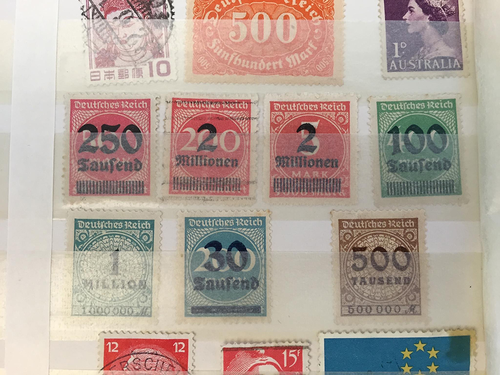
Overprinting on these stamps from the Weimar Republic reinforce the speed and severity of inflation in Germany. (Peter Crabbe)
Sat. Nov., 7 | On day three of Awayzgoose 12, Jim Moran sat down with Hamilton Wood Type & Printing Museum‘s Executive Director Peter Crabbe to discuss the museum’s future. Peter talked about the path that led to his role at Hamilton, from studying fine arts in Wales to designing exhibits for children’s museums in the United States to being captivated by Two Rivers, Wisconsin. [Read more]
Erik Spiekermann at his Spiekermann’s Precision Table in his P98a Studio in Berlin (Screenshot from his presentation)
Sat., Nov. 7 | Type designer and printer Erik Spiekermann joined us from the entrance of p98a, his letterpress workshop in Berlin, Germany. He’s wearing a neat white lab coat, like that of a German engineer—or, as he deadpans, of a mad scientist—and invites us in for a tour. [Read more]
Jim Moran printing “Halloween Nights” on a Showcard Press. (Michael Ditmer)
Thur., Nov. 5 | During this 45-minute demonstration, Jim Moran, the Master Printer at the Hamilton Wood Type & Printing Museum, printed the second color on a 26″ × 40″ advertising poster using a 41″ × 60″ proofing press. The blocks for this two-color Halloween poster, featuring lettering and a witch riding a broom, promoted paper hats, favors, and noisemakers are part of the museum’s Enquirer Collection. The first color, orange, had already been printed from the first block, and Jim’s demonstration focused on how to set up and print the second block. Copies of the completed poster will be available to purchase in the museum’s store. [Read more]