I am wondering if there exists a database of the metallurgical compositions of worldwide printing plates from the 15th century to the 20th? Basically, if anyone has pooled together metallurgical data from known plates from museum collections. [Read more]
The American Printing History Association is pleased to announce its own YouTube channel featuring videos that support its mission and programs. Take a look. We’re just getting started.
The American Printing History Association welcomes proposals for Impresos: Printing Across Latin American and Caribbean Cultures An APHA virtual conference, hosted by the Grolier Club, New York, NY. Online (EDT) October 22–23, 2021.
The 2021 APHA Call for Proposals is offered in English, Spanish, Portuguese, and French. Call for Proposals are due by May 1, 2021 PDF.
“Selections from the Stephen O. Saxe Collection” A Zoom visit with Amelia Fontanel, Associate Curator, Cary Graphic Arts Collection Friday, March 19, 2021 6:00pm EDT
Free and open to the public.
The Cary Graphic Arts Collection at the Rochester Institute of Technology is one of the world’s premier libraries on graphic communication history and practices. Their growing library holds over 45,000 volumes and over hundreds of archival collections. In 2020, the Cary Collection received a collection of rare books, metal printers’ type, presses and other printing equipment, and printed ephemera such as catalogs, unbound printed leaves, and business correspondence relating to printing history, from the estate of Stephen O. Saxe. Steve was an expert on American type foundries from the 19th century and a founding member of the American Printing History Association. Read more about Steve in this tribute by Amelia Fontanel on APHA’s website.
For this event, Amelia will provide an overview of the Cary Collection, and share a selection of typographic treasures from the Saxe collection. Organized by the New York chapters of the American Printing History Association for APHA members, and open to everyone interested in printing, typography, and special collections.”
The American Printing History Association Board of Trustees invites you to join the 2021 Annual Meeting on Saturday, January 30 at 2pm Eastern. Because of Covid-19, the meeting will be conducted via Zoom this year. The Annual Meeting will have guest talks by the recipients of our APHA Awards:
Are you aware of a printing device called a “multograph”? I know about the multigraph (invented in 1902), but I’ve also seen newspapers from the early 20th century refer to a “multograph.” Is that the same device, perhaps in an alternate or simply incorrect (mis)spelling? [Read more]
I would like to learn more about early use of abbreviations in printing, especially in Colonial America. Did these come about specifically in newspapers to save space? Any resources you can share would be appreciated. Thanks!
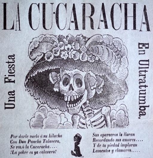
Posada popularized skeletal images called calaveras. Originally La Cucutacha appeared in a 1912 broadside and was later renamed La Calavera Catrina by Diego Rivera.
Called the Father of Mexican Printing, Artist of the People, and a prophet, Mexican artist/engraver José Guadalupe Posada (1852–1913) is credited by some as having created over 20,000 images. [Read more]
Solved! This wood-mounted electrotype of a wood engraving and print (3″ × 3¾″) are from the collection of Edna Macphail, which she inherited from her grandfather, the fine press printer Arthur W. Rushmore (1883–1955). [Read more]