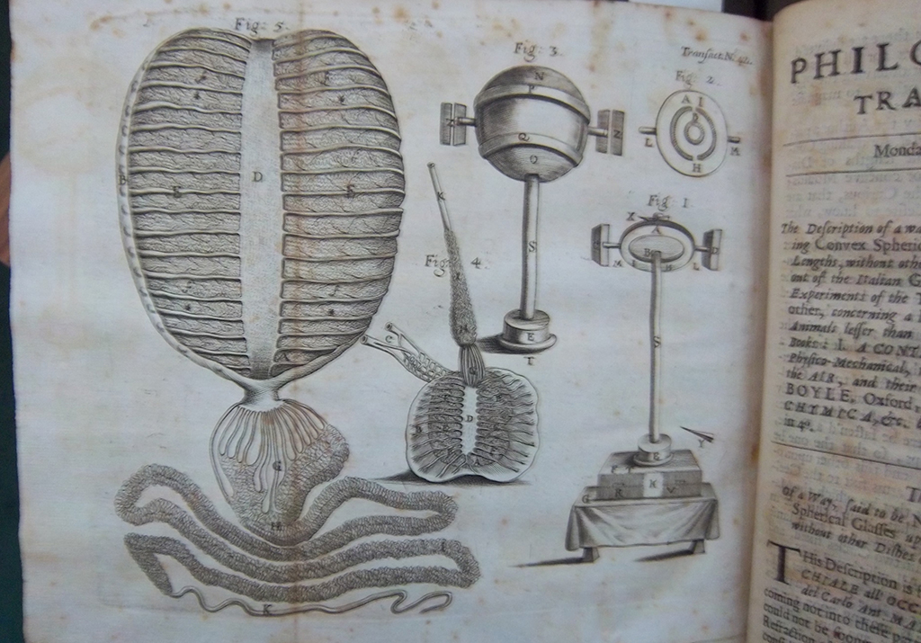
A microscopic organism and a camera obscura, Philosophical Transactions of the Royal Society of London, No. 42, Monday, December 14, 1668. (Leslie Smith)
[King was unable to attend the conference; her presentation was not delivered]
Leslie Smith’s research of seventeenth-century oddities in print embarked from a desire to map thought and to understand both the process of seeing in private versus public, and how that seeing is represented from a historical perspective. To do this, she studied diagrams, drawings and plates from texts that described accounts of curious observation, like in Nathaniel Crouch’s (Richard or Robert Burton, pseud.) The Surprising Miracles of Nature and Wonder (1683). In one such plate, spectators are publicly observing an array of cosmic spectacles in the sky—blazing stars, light rays, and clouds. The method used to depict these spectacles informs contemporary viewers of the visual experience itself, as does the way in which the onlookers are shown huddled in groups, with their fingers pointed towards the sky, informs us of the historical experience of observation. [Read more]
Do you know of an in individual or institution who has made or is making major contributions to printing history? The American Printing History Association presents two annual awards, one to an individual and one to an institution, as a way of recognizing “a distinguished contribution to the study, recording, preservation or dissemination of printing history, in any specific area or in general terms.” [Read more]
Early Ouija Advertisement, Lippincott Monthly Magazine, 1891 (Jesse R. Erickson)
9:30-11:00 am saturday, october 8
Jesse R. Erickson: The Magical and Mysterious Faces of Ouija: The Aesthetic History of the Ouija Board ♣ Art Seto: A Tale of Chinese Oracle Bones, Emperors, Superstitions, the Invention of Paper, and Printing: Their Relation to Playing Cards ♣ Sally Hildreth: Electric Mysticism: Astrology and the Gutenberg Galaxy
Jessse Erickson offered an ethnobibliographical approach to the aesthetic history of the Ouija Board, arguing that the materiality and material production of texts like the Ouija Board influence how we perceive things like race and culture. Following a brief consideration of the nineteenth-century ideological and artifactual antecedents of the device (i.e., spiritualism, theosophy, and the occult; planchettes and “The Witch Board”), he surveyed instantiations of Ouija Boards from the late nineteenth-century to the twenty-first century, paying particular attention to different modes of printing and production and the ways in which ever-shifting typography and designs conveyed specific meanings about certain ethnic and racial categories in particular social-historical moments. [Read more]
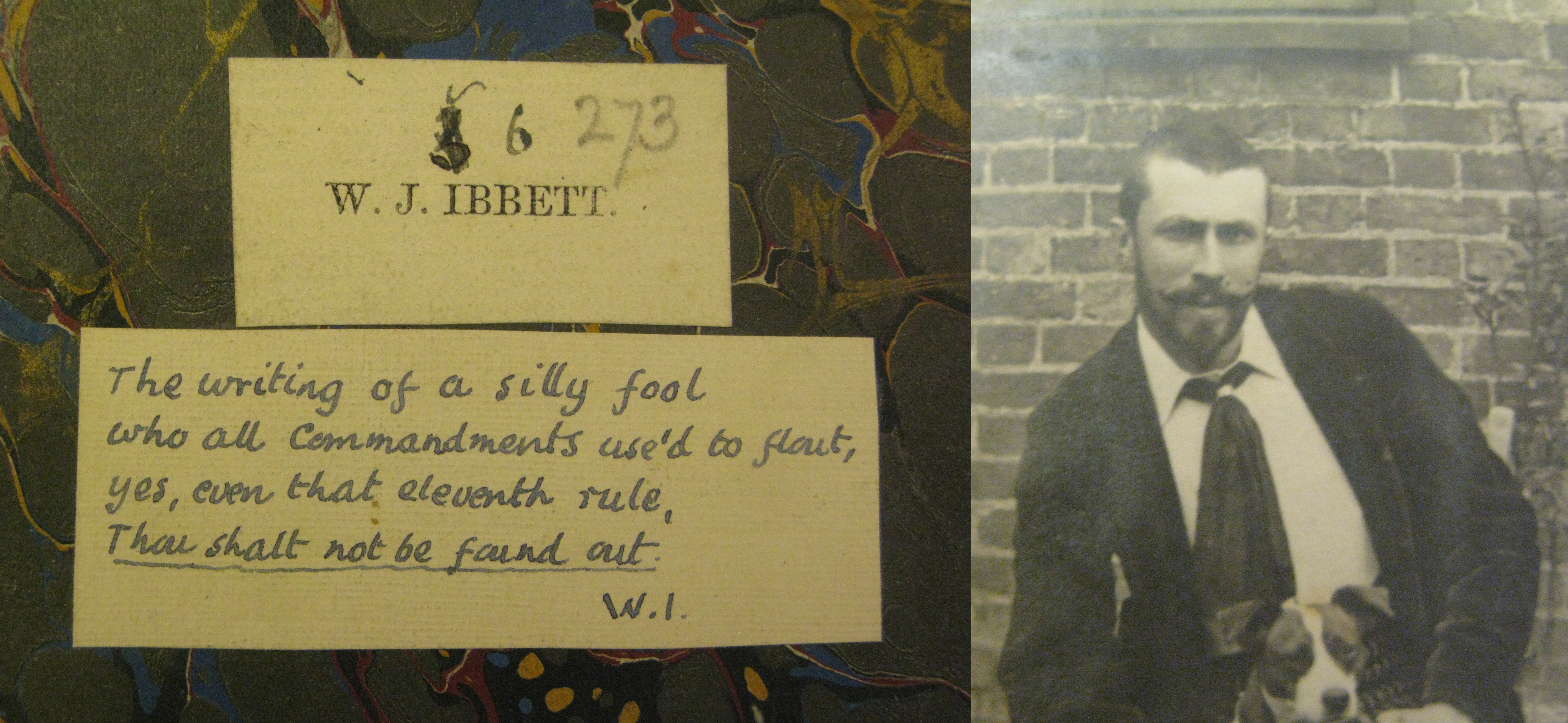
W.J. Ibbett’s handwritten bookplate on his personal copy of his first book, Poems by Antaeus, 1889. Photo of Ibbett adhered to the frontispiece position of the same copy. (Norman Colbeck Collection, Special Collections, University of British Columbia)
3:15-4:15 pm saturday, october 8
Casey Smith: Ibbett Did It: Piquerism, Poetry, and Letterpress Printing ♥ E. Haven Hawley: William Berry: Publisher, Scoundrel, and Spiritualist
This fascinating session presented by Casey Smith and Haven Hawley (with Heather Smedberg as her surrogate) could have as well been named, “unsolved mysteries.” [Read more]
Dr. L. Bendikson with camera for microphotography. Undated. photCL 107 vol13 pg26 (140). (The Huntington Library)
10:00 am-noon friday, october 7
The Spectral Arts of Dr. Lodewyk Bendikson at the Huntington: A Presentation by Laura Stalker, Avery Deputy Director of the Huntington Library and John Sullivan, Head of Imaging
“Any sufficiently advanced technology is indistinguishable from magic.”
—Arthur C. Clark
Dr. Lodewyk Bendikson was a pioneer and leader in the development of forensic photography and the head of the photography department of the Huntington Library from 1928 until his retirement in 1943. By way of introduction to the work of Bendikson, Laura Stalker began her presentation with a brief history of the development of the Huntington Library. George Watson Cole, a leader in the library profession, was appointed by Henry Huntington in 1915 as the first librarian and cataloger of the rapidly growing Huntington book collection housed at that time in New York City. The collection was relocated to San Marino, California, upon completion in 1920 of the newly constructed Huntington Library building located on the grounds of the Huntington estate. It was noted that Huntington Library will be celebrating its one hundredth anniversary in 2019. [Read more]
Alchemists revealing secrets from the Book of Seven Seals. Detail from The Ripley Scroll, ca. 1700. (Manly Palmer Hall collection of alchemical manuscripts, circa 1500-1825. Getty Research Institute)
9:00 am-1:00 pm sunday, october 9
David Brafman, Rhiannon Knol, and Marcia Reed welcomed our group to the Getty Research Institute. We split into two groups, one following David into the GRI’s gallery, the other into the GRI’s conference room to view about a dozen artists’ books to which Marcia referred in her plenary talk relating to the conference theme. The exhibition wasn’t yet open to the public, so this was a sneak peek of the Art of Alchemy. [Read more]
Thanks to everyone who attended this year’s APHA conference at the Huntington. In the months and days leading up to it, we represented the theme, The Black Art & Printers’ Devils: The Magic, Mysticism, and Wonders of Printing History, with a logotype that individuals always asked about. Did it have something to do with Prince? Aleister Crowley? International currency? [Read more]
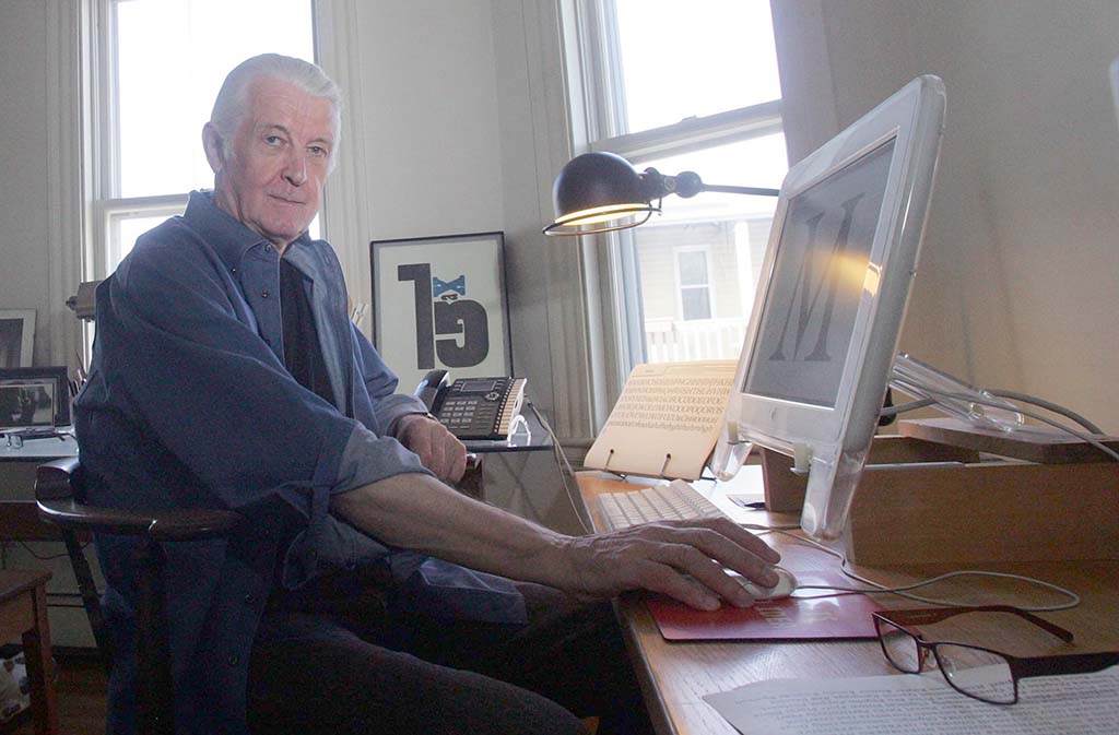
Type designer and MacArthur Foundation Award Recipient, at his home in Cambridge MA, 2010. (Photo by Aynsley Floyd/The John D. and Catherine T. MacArthur Foundation)
APHA New England is delighted to announce that Matthew Carter will present APHA’s Lieberman Lecture on Saturday, December 3, 2016, at 2:00 PM at the Museum of Printing in its new location at 15 Thornton Avenue in Haverhill, Massachusetts. Please RSVP. [Read more]
The platen and hose of the James Franklin Press in Newport, RI.
This is the fourth in a series of posts that will appear throughout the year.
The term “wooden common press” is fairly self-explanatory. It is a press, and it is made of wood. Before the invention of the iron hand press, all presses were common presses, and all of them were wooden. Since January, my teammates and I at Rochester Institute of Technology have been designing an eighteenth-century wooden common press. What proved to be one of our greatest challenges—and one of our favorite adventures—was the search for wood from which to build the press. [Read more]
Here’s a question tuned to the theme of our upcoming conference The Black Art & Printers’ Devils at the Huntington Library. Perhaps an APHA member or friend of APHA has knowledge about this particular uppercase “M” that featured in an 1890 book of poetry privately printed at the Chiswick Press in London. Has anyone seen this spooky “M” in other publications?
Enhanced screengrab from the HathiTrust copy of Sand Key (anon., Chiswick Press, 1890).