Networks Session, Panel Recap
Nina Schneider

Example of a class survey by a student at Ohio University. (Miriam Intrator)
Example of a class survey by a student at Ohio University. (Miriam Intrator)

Katherine DeLamater, left, assists Ruth Lingen in couching a pigmented black sheet of paper onto Leonardo Drew plates filled with ‘magnum’ bits.
Ruth Lingen introduced the audience to her decade-long work at Pace Paper—a satellite of Pace Editions and Pace Gallery in Brooklyn, New York—by showing examples of her collaborations with artists. To the amazement of the audience Lingen explained some of the paper and print requirements that constantly push the boundaries of artistic matrices. Shepard Fairey (perhaps best known for his Hope poster created for Barack Obama’s presidential campaign), the pop-artist Donald Baechler, painted pulp monoprints by Daniel Heidkamp, Leonardo Drew (sculptural prints on an enormous scale), Li Songsong’s dimensional work were discussed and explained during this lively plenary session. [Read more]

Katherine Ruffin demonstrates printing on an iron hand press in conjunction with the Protest in Print exhibition at the Davis Museum, Wellesley College, November 7, 2017.
The standing-room-only crowd of over fifty attendees learned about the bookmaking practices, personal histories, and artistic philosophies of two book artists: Katherine McCanless Ruffin who shares her passion of print and paper with her students at Wellesley College and Carolee Campbell who realizes her vision of the ideal book through thoughtful concept and high craft. [Read more]

Alchemists revealing secrets from the Book of Seven Seals. Detail from The Ripley Scroll, ca. 1700. (Manly Palmer Hall collection of alchemical manuscripts, circa 1500-1825. Getty Research Institute)
David Brafman, Rhiannon Knol, and Marcia Reed welcomed our group to the Getty Research Institute. We split into two groups, one following David into the GRI’s gallery, the other into the GRI’s conference room to view about a dozen artists’ books to which Marcia referred in her plenary talk relating to the conference theme. The exhibition wasn’t yet open to the public, so this was a sneak peek of the Art of Alchemy. [Read more]

Thanks to everyone who attended this year’s APHA conference at the Huntington. In the months and days leading up to it, we represented the theme, The Black Art & Printers’ Devils: The Magic, Mysticism, and Wonders of Printing History, with a logotype that individuals always asked about. Did it have something to do with Prince? Aleister Crowley? International currency? [Read more]

(Nina Schneider)
The Book Club of California celebrated its 235th publication with a lecture tour, of sorts, for members and friends up and down the Golden State during the month of May. Robert Bringhurst’s Palatino: The Natural History of a Typeface is an important and elegantly produced book that is as much about the typographer as it is about the typeface. Hosted at the new Hoffmitz Milken Center for Typography at Pasadena’s ArtCenter College of Design, Bringhurst gave an illustrated talk about his book, Hermann Zapf and the typographer’s sixty-year devotion to the Palatino typeface. Spanning the major eras in printing history, Zapf’s compulsion, dictated by his uncompromising attention to detail, resulted in Palatino being designed for foundry type, redesigned for film, and redesigned again for digital typography. Bringhurst’s exploration of these modifications was the impetus for the book and he shared some of the highlights during his lecture. As he explained, he wrote a natural history of a typeface through the life of Hermann Zapf. [Read more]

The American Printing History Association is pleased to announce a call for papers (pdf) for our 2016 conference at the Huntington Library, October 7-8. We are very excited about this year’s theme: “The Black Art & Printers’ Devils: The Magic, Mysticism, and Wonders of Printing History.” We hope that you will consider submitting a proposal for a presentation or demonstration. Proposals are due March 15. [Read more]
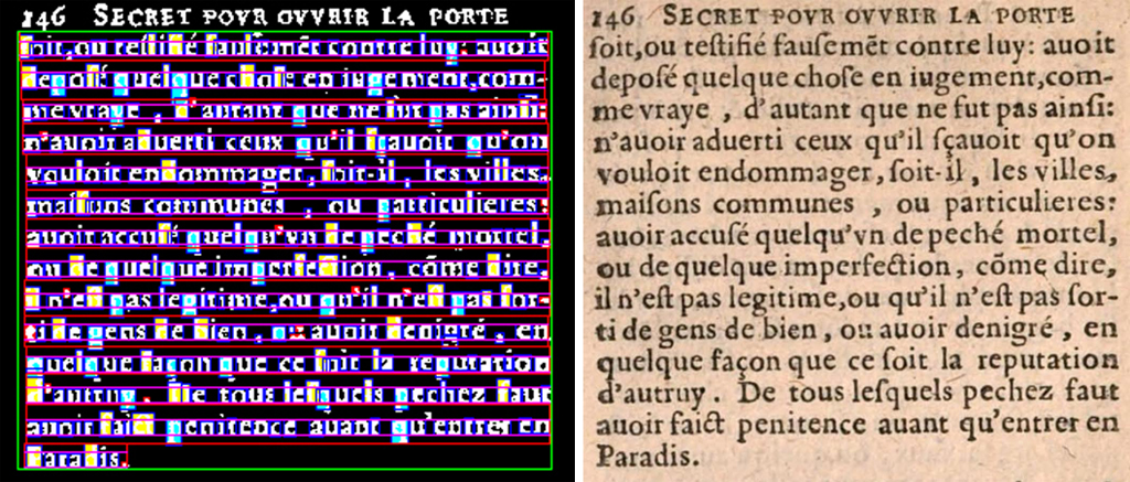
At left: digitized paragraph of Secret pour ouvrir la porte de Paradis en mourant, 1623, selected and its characters segmented and classified as ascender/descender and x-height, using pattern recognition techniques. (Charles Bigelow and Richard Zanibbi)
Charles A. Bigelow & Richard Zanibbi: “Analysis Of Typographical Trends In European Printing 1470-1660: Comparison of Automated Methods To Palaeotypographical Approaches” ¶ Philip Weimerskirch: Some Little-Known Sources for the History of Early American Printing Presses”
Illustrated with numerous graphs, charts, and statistics, Chuck Bigelow presented current research on typographical trends he has been analyzing with Richard Zanibbi. Encompassing historiography, culturomics (the study of cultural trends through quantitative analysis of digitized texts), and the recent discipline of vision science. For their purposes, vision was equated with reading: layout, type size, and type style, the partners looked at 22,000 digitized books ranging in date from the fifteenth- to the seventeenth centuries. [Read more]
Monotype ornaments ready to sell. (Nina Schneider)
A full day of Monotype type casting demonstrations at Bixler Press & Letterfoundry
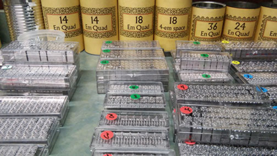
Twenty of us piled into a van for the 90 minute drive from Rochester through rolling hills and magnificent autumn foliage to the town of Skaneateles, on the northern shore of the Finger Lake for which it’s named. There, Michael and Winifred Bixler welcomed us into their shop and home where we met up with seven more attendees who had arranged their own transportation. Michael began by giving us a brief history of Monotype development in America and England, and then telling us about the Bixler Letterfoundry. Established in 1968 with the purchase of their first Monotype machine, the Bixlers built up their business with an extensive inventory of Monotype faces, the ability to fulfill large orders, and timely delivery. [Read more]
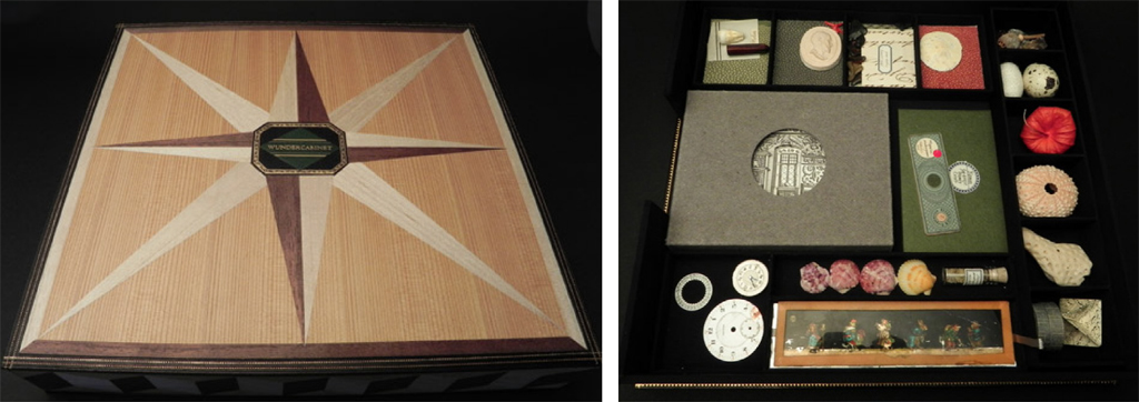
The American Printing History Association is pleased to presents the 2015 J. Ben Lieberman Lecture “The WunderCabinet* The Curious Worlds of Barbara Hodgson & Claudia Cohen” to be delivered by Barbara Hodgson. The lecture is at 6pm, Tuesday, November 10, 2015 at UCLA Charles E. Young Research Library Main Conference Room. Free and open to the public. Reception to follow. Please RSVP by November 6. Hosted by UCLA Library Special Collections. Directions and parking. [Read more]