Research Methods New and Old
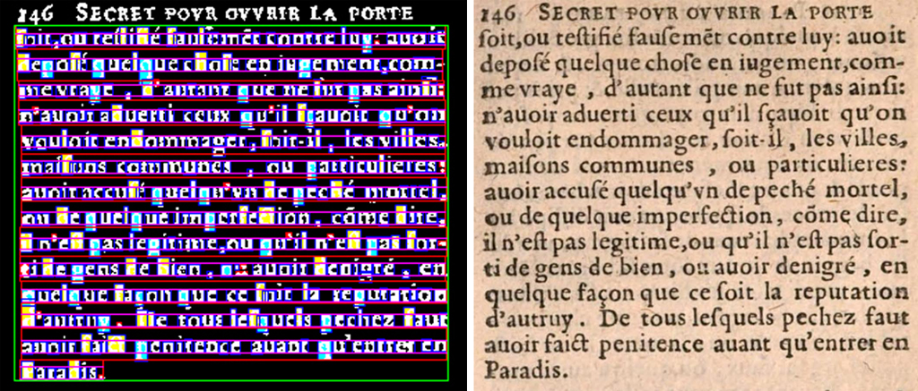
At left: digitized paragraph of Secret pour ouvrir la porte de Paradis en mourant, 1623, selected and its characters segmented and classified as ascender/descender and x-height, using pattern recognition techniques. (Charles Bigelow and Richard Zanibbi)

Charles A. Bigelow & Richard Zanibbi: “Analysis Of Typographical Trends In European Printing 1470-1660: Comparison of Automated Methods To Palaeotypographical Approaches” ¶ Philip Weimerskirch: Some Little-Known Sources for the History of Early American Printing Presses”
10:45 am saturday, october 24 ⋅ track 1
Illustrated with numerous graphs, charts, and statistics, Chuck Bigelow presented current research on typographical trends he has been analyzing with Richard Zanibbi. Encompassing historiography, culturomics (the study of cultural trends through quantitative analysis of digitized texts), and the recent discipline of vision science. For their purposes, vision was equated with reading: layout, type size, and type style, the partners looked at 22,000 digitized books ranging in date from the fifteenth- to the seventeenth centuries.
Bigelow explained that the type sizes in books in these centuries are a subset of available sizes. A broad range of type sizes becomes available in the sixteenth century, but printers tend to use only a narrow range of them. Fifteenth century Italian type sizes commonly range between 14 to 18 points; sixteenth century books are commonly printed in 11 to 14 point, when smaller and larger sizes are available; seventeenth century type sizes are predominantly 10 to 12 point, although many smaller and larger sizes are available from type foundries. In the Reformation, books from Protestant printers tend to use smaller types for both frugality and format (smaller books were easier to hide from anti-Reformation authorities). Overall, 10, 12, and 14 point types are the most common sizes from 1550 to 1670, with 12 point dominant.
Three factors that influence changes in type size and style are culture (e.g. gothic to roman, to italic), economics (smaller sizes are cheaper in terms of paper usage and cost, while sizes above 14 are expensive), and the physiology of vision (sizes below 9 or 10 point slow reading speeds). Bigelow also noted that type styles affect sizes. The use of Roman increases in the sixteenth century for French texts; Italic was developed in 1501 and was popular until 1600 for the Latin language. However, in the late sixteenth century Roman becomes the overall dominant style. Bigelow concluded by noting that beauty is equated with legibility, but there is still plenty of opportunity for imperfection.
* * *
A lifetime of printing history research was shared by Philip Weimerskirch who has traveled for primary sources in the days before the internet made research faster, if less adventurous. Highlighting a few of the important sources, Weimerskirch made special mention of Record Group 241 in the National Archives. These are the records for the Patent & Trademark Office during the years 1836 to 1973 and comprise the annual census of printers and publishers.1 Weimerskirch has been able to use these types of records to compile his own data.
The American Antiquarian Society maintains a card file on some 8,000 American printers who were active in or before 1820, and one drawer of cards for printers who were active after 1820. The catalog drawers contain two sets of cards. In the front of the drawers are cards with a chronology of the printer’s life and work, and in the back of the drawers are cards containing a bibliography of sources about the printer. This card file has been built up over many years by the staff of the American Antiquarian Society, and it is an invaluable source of information about early American printers.
Rollo Silver, the notable scholar of the early history of printing in America, kept meticulous notes that he bequeathed to Brown University. They fill sixty-nine large scrapbooks, and they contain his handwritten notes, his correspondence with historical societies, etc., photostats of manuscripts and many pamphlets and offprints of articles. Mr. Silver lived in Boston, and his notes are especially strong in documenting New England printers and inventors of printing presses. There are several other collections of scrapbooks on the history of printing in America, but none of them are nearly as extensive as are those of Mr. Silver.
Although these three are the main sources of American printing historiography, Columbia University has the complete ATF catalog, and many other archival treasures can be found at the College of William and Mary, the Smithsonian Institution library (which collected reports and brochures from industrial fairs and international exhibitions). Mr. Weimerskirch also mentioned that numerous inventor’s copies of printing press patents can be found in historical societies, museums and libraries.
- 1 The United States Patent Office, now called the Office of Patents and Trademarks, was founded in 1790, and on December 15, 1836, a fire destroyed the building containing the patents and patent models in it. Between 1790 and the time of the fire, the Patent Office issued some 45 patents for printing presses, and although the fire caused a terrible loss, there are ways of recovering information about some of these early patents. The two most important ones are some manuscripts in Record Group No. 241 in the National Archives and the patents owned by the inventors. There were two copies of every patent. One was retained by the Patent Office, and one was given to the inventor. Some of those that were given to the inventors survive in libraries, historical societies and museums.