Frontiers Session, Panel Recap

A small collection of Haldeman-Julius’s Little Blue Books. (Steve Cox)
 Sat., Oct. 26 | Moderated by Seth Gotleib: Steve Cox, “A Radical Press in Kansas: Haldeman-Julius’s Forgotten Publishing Dynasty” ❉ Jessica Barness and Amy Papaelias, “Radical Scholarship: The Visual Language of Emerging Disciplines in the United States” ❉ Matthew Kirschenbaum, “Kamau Brathwaite’s Printer”
This session provided a lively glimpse into the unique printing and publishing practices of three radical subjects.
Steve Cox
“A Radical Press in Kansas: Haldeman-Julius’s Forgotten Publishing Dynasty
Steve Cox mapped out the unique publishing history of a tiny town in Kansas where a socialist publisher, Emanuel Haldeman-Julius (1889–1951), crafted successful (and bit scandalous) publications enjoyed by millions for nearly three decades.
In 1919, Haldeman-Julius purchased the weekly, Appeal to Reason, from Julius Wayland who nurtured the research and writing of Upton Sinclair’s The Jungle. The publication was renamed the Haldeman-Julius Weekly, and within a few years Haldeman-Julius and his wife, Marcet, changed the format to a pocket-sized, 64-page pamphlet titled the Little Blue Books. This series, as well as a later series of Big Blue Books created in 1925, were produced cheaply and sold individually for 5 or 10 cents. The publication aimed to educate and enlighten common working men and women, with titles from literary classics as well as new self-improvement topics, sex, love, romance, and entertainment. Despite the non-conformist opinion writings and an FBI probe the publication thrived until the late 1940s and continued until a fire destroyed all remaining volumes and the warehouse in 1978. Monthly and quarterly publications penned by Haldeman-Julius and other like-minded authors during the 1920s critiqued organized religion and the works of J. Edgar Hoover. In 1948, Haldeman-Julius was sentenced to a jail term for tax evasion and was found dead just weeks before his sentence was to begin. Throughout his career, Emanuel Haldeman-Julius equipped readers with a wealth of information and empowering knowledge from a small town in Kansas that virtually everyone wanted in their pocket.
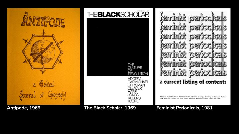
Covers of the first issues of Antipode: A Radical Journal of Geography(1969), The Black Scholar (1969) and Feminist Periodicals: A Current Listing of Contents (1981).
Jessica Barness and Amy Papaelias
“Radical Scholarship: The Visual Language of Emerging Disciplines in the United States”
Amy Papaelias charted a visual language tour of three radical journal publications and questioned how each design affects the perceived integrity of its content. First Antipode, a radical journal of geography, which began in 1969 at Clark University in Worcester, Massachusetts. In an attempt to maintain street credibility and academic credentials, this journal evolved from frantically assembled collages to a typeset script and later a refined publication including a website under the recent guidance of Basil Blackwell. The trajectory of the second case study, The Black Scholar was most revelatory. Under the leadership of Bob Chrisman, Nathan Hare, and printer Allan Ross (Graphic Arts of Marin) TBS gave sorely needed voice to Black writers, scholars, activists, and artists and sought to nurture dialogue within its pages. Discoveries made by Ms. Papaelias and her research partner, Jessica Barness, uncover the complex history of the early years of this publication. Ross’s daughter, Elizabeth, shared deeper stories of his difficult childhood as a Jewish immigrant in New York and, later, his propensity for design which could speak to activists and scholars alike. Ross’s initial conversations with Chrisman and Hare quickly solidified their collective interest in creating a space for critical conversations about the Black experience. The Black Scholar remains a stalwart resource and critical assemblage of Black voices and, for better or worse, is currently published by Routledge (Taylor & Francis). Lastly, the Feminist Periodicals, a listing of content pages, started with scissors, glue, and a copier in 1981 at the University of Wisconsin-Madison. The journal with its unique focus transitioned to online publication and is a major reference source for Women and Gender Studies research. In hindsight, the visual and literary evolution of these publications appeared radical. It was a delight to see the raw early designs and note the transformations over time wherein those leading each journal responded to the changing content and publication trends.

Colophon to Kamau Brathwaite’s Barabajan Poems (Photo: Matthew Kirschenbaum)
Matthew Kirschenbaum
“Kamau Brathwaite’s Printer”
Matthew Kirschenbaum stunned the audience by introducing a grey Macintosh StyleWriter. This inkjet printer is of the same vintage and model as the one used by Edward Kamau Brathwaite in 1990 during a Harvard residency that allowed him to write in light and make sound visible. The prolific and acclaimed Barbadian writer has used other computers—to craft his X/Self’s Xth Letters from the Thirteen Provinces he employed an IBM Eagle—but consistently returns to his Macintosh, coveting its memory as “virtual temporality in which any point in time can be reached …” Working outside of the colonial tradition, the computer allowed Brathwaite to publish what he alone envisions and afforded him creative control over his own work. The stair-stepped lines, “jaggies,” Brathwaite’s computer recorded as he wrote appeared on the printed sheets coming from his beloved StyleWriter—his bit-mapped voice retains its vigor with the immutability of print. In many of his numerous publications, Brathwaite reveals the metadata of his editing and publishing within the colophon as if Sycorax [the unseen mother of Caliban in The Tempest] is speaking the words within the computer. Brathwaite pushed against the publishing norms with customized typefaces and spelling within the text and time and date stamping for his authorial interventions on the typescript. He did concede design authority on occasion such as when the “s” in Aldo Novarese’s font Stop was clipped for legibility on the cover of Middle Passages, but this seemed the exception, not the rule. Thank you, StyleWriter! It was a pleasure to meet such a radical and revolutionary printer. Brathwaite’s voice appears to be solidly one with Sycorax and we are all better for it.