Ands & Ampersands
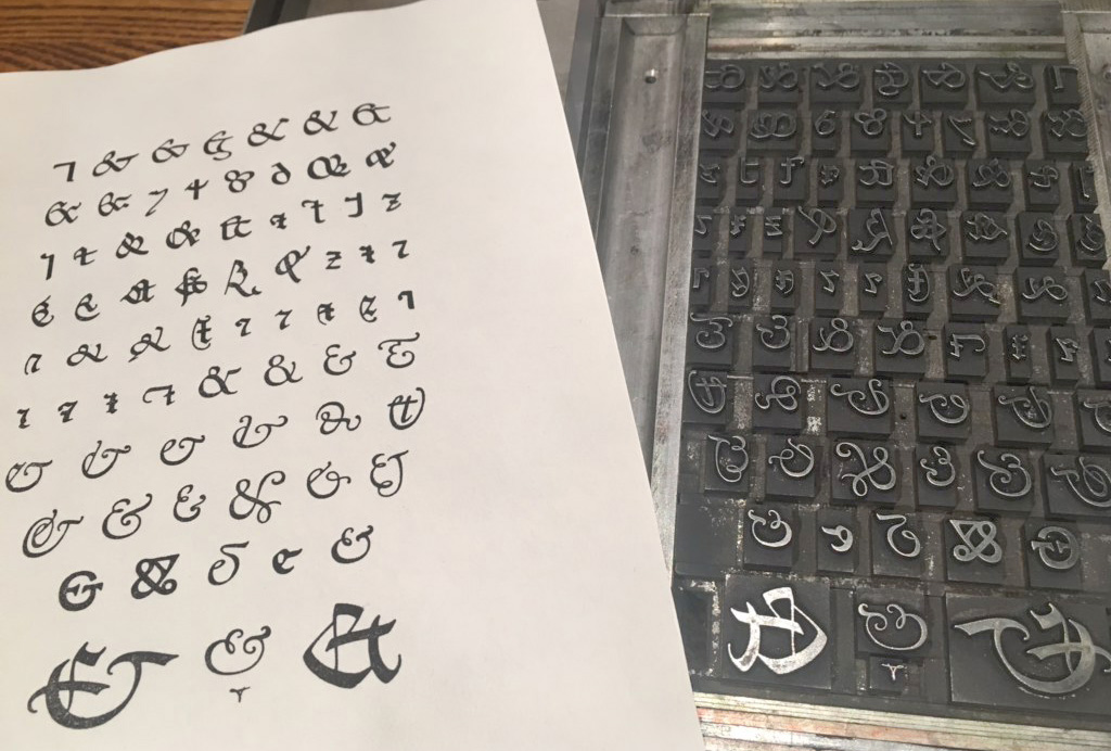
Frederic W. Goudy’s many interpretations of the ampersand’s design through history. Original printing form, ca. 1946, with a modern print. (RIT Cary Graphic Arts Collection)
“What in Sam Hill is an Ampersand?” asked Frederic W. Goudy in The Typophiles 1936 Christmas keepsake titled Diggings from Many Ampersandhogs. The Typophiles, founded in 1930, brought together typographers, designers, and printers. The organization published many important books on the history and practice of the typographic craft, some of them scholarly, some playful.
Call for Entries
Paul A. Bennett, director of typography for Mergenthaler Linotype Company, sent out a call for entries for this Typophiles’ keepsake asking participants to supply 125 numbered copies on the subject of Ampersands. The trimmed page size was to be 3¾″ × 5⅞″. Frederic W. Goudy responded with a scholarly sixty-four-page study of the “&” going back to the first century B.C. His chapter was called “Ands & Ampersands.”

Ampersand publication call for entries, The Typophiles, ca. 1935. (*RIT Cary Graphic Arts Collection.)
“Ands & Ampersands”—Diggings from Many Ampersandhogs
The RIT Cary Graphic Arts Collection possesses three copies of the Typophiles’ Diggings from Many Ampersandhogs. Copy number 2, bound and in a slipcase, is inscribed to Howard Coggeshall, and an un-numbered and unbound copy is inscribed by Goudy to Melbert B. Cary, Jr. The third copy (No. 74) is in a bound edition in slipcase. Copy number 1—Goudy’s own—was lost in the 1939 fire at his workshop in Upstate New York.

Diggings from Many Ampersandhogs, New York: The Typophiles, 1936.
HERBERT H. JOHNSON
In the spring of 2017, I met with Goudy expert and former RIT Professor, Herbert H. Johnson to confirm some information for a presentation I was preparing. After lunch, Herb invited me to his home where he gave me a galley containing the original metal type from page 239, of Fred Goudy’s A Half-Century of Type Design and Typography, 1895–1945, vol. 2, Typophile Chapbook XIV, 1946. It shows 70 different pieces of type representing the “&.” This galley is now a part of the Cary Collection thanks to the generosity of Professor Johnson.

Type form for page 239 of Fred Goudy, A Half-Century of Type Design and Typography, 1895–1945, vol. 2, New York: The Typophiles, 1946.
A few weeks later, Herb called to say he found another galley of type from Goudy’s “Ands & Ampersands.” This contained all the “headings” used as examples referred to in the text. A lot of the type was pied and needed to be meticulously reconstructed.

Pied galley of the original type for Goudy’s “And & Ampersands,” 1936.
As an old comp, I took on the challenge of trying to make sense of all the pied type. Using photocopies from Goudy’s “Ands & Ampersands” I slowly pieced together the type and spacing. Once I had completed the second heading’s reconstruction, I realized the brilliance that went into creating the mechanical construction of each of these headings. All &s were cast on a 30 point body. All descriptions, set in Deepdene, were on 10 point body with one point between lines; 3 point leading above and 6 point leading below—totaling 30 points. The numbered reference was set in 12 point type, flush left on a 1 pica measure, allowing the compositor to use a 12 point 4em space—which equals 3 points—above and below the figure and a 12 point em quad to make the vertical space total an even 30 points. These dimensions may seem a bit too tedious to digital designers and typesetters working these days, but in hot metal composition days this brought simplicity and an æsthetic beauty to all these headings.

Original type from “Ands & Ampersands,” as received from Professor Johnson.

“Ands & Ampersands,” page 45, showing the painstakingly-set headings.
Besides the above-mentioned type and the three Typophile keepsake books in the Cary Collection, I was able to research original correspondence between Frederic W. Goudy and his close personal friend, Howard Coggeshall, a successful printer at Utica, New York. Most of Coggeshall’s correspondence with Goudy was transferred to the Cary Collection in 1961 along with one of the largest collections of metal type, cast by Goudy himself, known as “The Lost Goudy Types.”
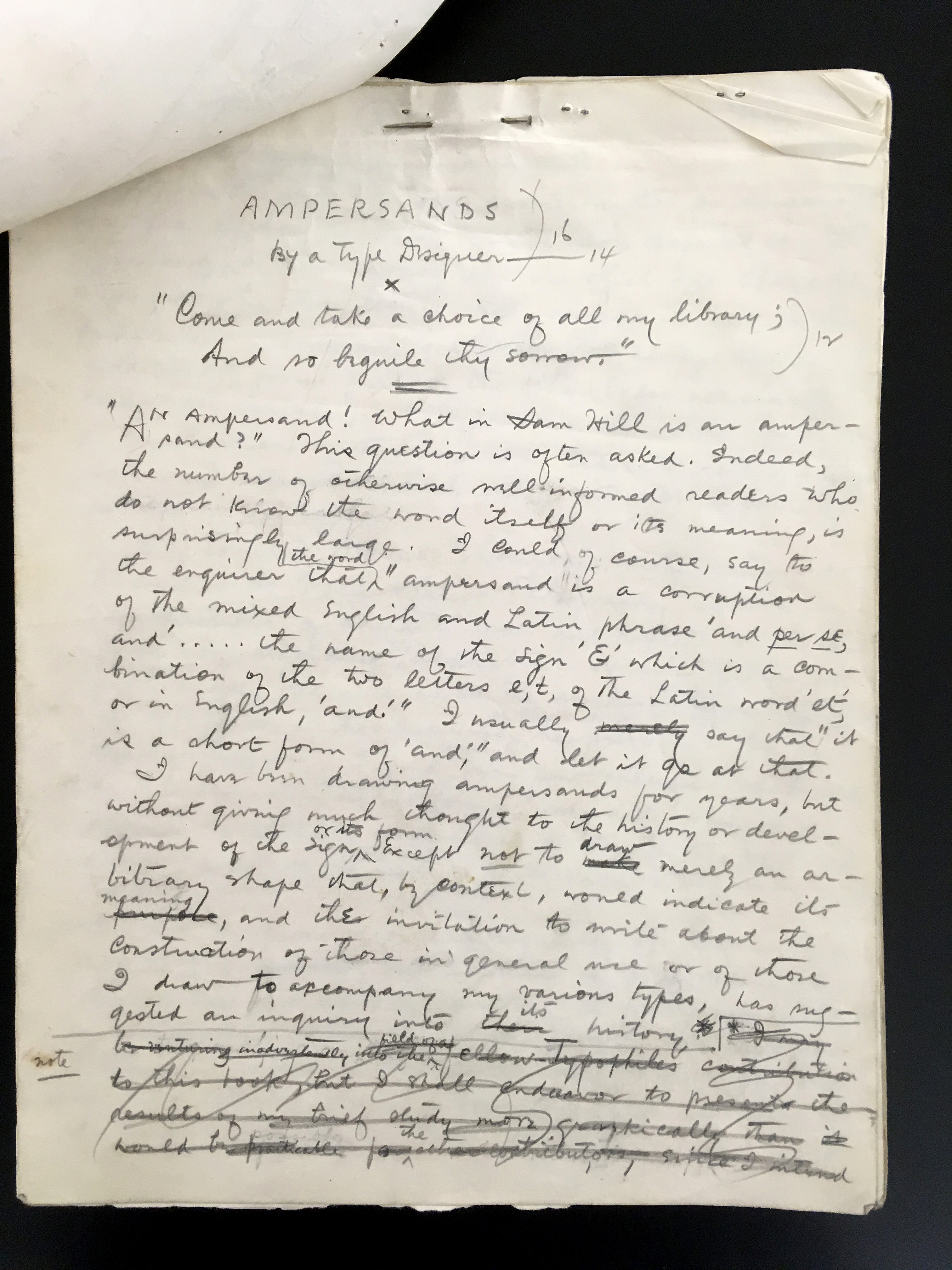
Goudy’s manuscript for “Ands & Ampersands,” ca. 1935. Howard Coggeshall Papers 1932–1949, RIT Cary Collection.
GOUDY’S Original MANUSCRIPT
From the Cary Collection, Associate Curator, Amelia Hugill-Fontanel, retrieved a file filled with scores of documents regarding Goudy’s “Ands & Ampersands.” In it, I found Goudy’s 19-page hand-written manuscript that Coggeshall used to set the type, plus the first, second, third, and final galley proof and many letters between them regarding the progress of the publication.
AUTHOR’S NOTE
Goudy’s sharp eye and brilliant mind showed themselves through these letters and proofs. For example, on the very first proof of the “Author’s Note” page, Goudy marked the alignment of the serifs between the top of the initial capital “W” and the capital “H” that made the first word “WHEN.” It was off by a third of a point; and, they must have lightly sanded the front of the “W” to make it right. Another example of Goudy’s sharp eye was his marking an italic capital “C” in four places: pages 30, 39, 43, and 49. Evidently an italic cap “C” matrix was inadvertently wrongly placed in the matrix case. It’s almost imperceptible, unless you’re looking for it.

Goudy’s marking of the top alignment between the initial capital W and the HEN on the first proof.

Goudy marked the capital C in “Company” because it was italic.
SPEEDY CORRESPONDENCE
During the 1935–36 time period that “Ands & Ampersands” was being created, mail was transported by train so efficiently that delivery between Marlborough and Utica—both in New York state—occurred daily. Goudyʼs hand-written manuscript is dated July 1936. A Goudy letter to Howard Coggeshall dated October 28, 1936 talks of “finishing all the amp. patterns” and “Fred [F.W.G’s son] has 3 still to cut. Will cast all tomorrow.”
November 7, 1936–6:30 p.m. letter to H.C. in which Goudy writes,
“Think I’ll use Ands & Ampersands . . . for the title.”
Then, the next day, November 8, H.C. sent this letter to Goudy:
“Why don’t you use this for title page . . . &&&& & &&&&&&&&&& That spells ‘Ands & Ampersands,’ and you can let ’em figure it out for themselves.”
REPRINT “ANDS & ampersands” BOOKLET?
The original Goudy “Ands & Ampersands” booklet is not only a treasure of knowledge about the ampersand’s origin and history, but it is a valuable typographic gem. There were only 125 copies issued in 1936. They were bound and put in slipcases under the title Diggings from Many Ampersandhogs. Most of the existing copies reside in museums. Occasionally, a copy comes up for sale and can be followed through American Book Prices. A copy, last sold August 5, 2015, went for $750.00. If you are of a mind to study one, you’ll need to make arrangements with a library that has a copy and travel there to study it.†
We considered doing a reprint of “Ands & Ampersands.” Printing an edition of only 125 copies like the original would make it quite expensive. An edition of 250 reprints makes the most sense. Our first challenge would be to find a paper similar to the original Worthy Hadrian. The next challenge is how to best print it. My first thought was to find a Monotype house that has matching Deepdene matrices and have them typeset the booklet. We would then compose the pages using the original “headings” type in the Cary Collection. I was willing to undertake this challenge until I spoke with David Pankow, Curator Emeritus of the Cary Collection. David maintained that reprinting “Ands & Ampersands.” using photopolymer plates was the only way that made sense, considering time, cost, and accuracy. Fortunately, The Cary has a complete set of unbound signatures that could be scanned and saved as pdf files for making photopolymer plates. Meanwhile, you can check with one of the listed libraries that hold copies of the Typophiles book.
GOUDY’S RESEARCH OF THE AMPERSAND’S HISTORY
Goudy was a well-read, self-taught scholar and historian. His writing about searching the history of the & disclosed that when he stated “. . . I have shown only the symbols for et and the various forms of ampersands I find in my own modest library, and for my materials have gone merely to sources immediately available.” In the beginning he explains that the word “ampersand is a corruption of the mixed English and Latin phrase, ‘and per se, and’. . . the name of the sign & which is a monogram of the two letters e, t, of the Latin word et, or in English, and.” For a glimpse of what is in Goudy’s booklet, we show four pages here.‡

“Ands & Ampersands,” pages 12–13.

“Ands & Ampersands,” pages 14–15.
Goudy’s research dates to the 1st century B.C. manuscripts written by scribes of Tiro. Pages 16 and 17 show and describe interesting &s from the 7th to the 9th century. In pages 22 and 23, he shows ten &s and explains “Figure 20, ms. Petrus Comestor, 1283, might almost pass for the & of a gothic type of the fifteenth century.” He further explains, “. . . two variations of the figure 1 sort, both taken from early English records: one I show as figure 20A; the other, shown as figure 21, is a variation peculiar to the Saxon tongue.” Goudy then describes &s from 16th century English Courthand (Figures 23–26) and figure 27 from 1673.

“Ands & Ampersands,” pages 16–17.

“Ands & Ampersands,” pages 22–23.
The first 30 &s displayed in “Ands & Ampersands” are from manuscripts. The remaining 38 shown are from metal printing type. In the colophon he reveals “The types, Deepdene Roman & Italics, were designed by the author. The Ampersands were engraved and cast in types by Fred T. Goudy from drawings by the author.” Nowhere does he state his name except for the page just before “Author’s Note” where the printing shows: “Copyright 1936, Frederic W. Goudy”; the title page states the booklet is “by a type designer.”
The booklet is fascinating reading. Goudy’s research and his tremendous vocabulary shine brightly and cause the reader to seek more about the people and publications he mentions.
“What in Sam Hill is an Ampersand?” you might ask. There are at least 68 answers to your question in Frederic W. Goudy’s “Ands & Ampersands.”§
—30—
* All photos appear courtesy of the RIT Cary Graphic Arts Collection.
† Libraries with copies of Diggings from Many Ampersandhogs, 1936 or And & Ampersands, published separately by Melbert B. Cary, Jr.’s Press of the Woolly Whale in 1938.
California Historical Society, San Francisco, CA 94105
University of California, Los Angeles, Los Angeles, CA 90095
Carnegie Mellon University, Hunt Library, Pittsburgh, PA 15213
The Claremont Colleges, Claremont, CA 91711
Columbia University Libraries, New York, NY 10027
Dartmouth Library, Hanover, NH 03755
Grolier Club, New York, NY 10022
Huntington Library, San Marino, CA 91108
Library of Congress, Washington, DC 20540
McGill University Library, Montreal, Canada
University of Minnesota, Minneapolis, Minneapolis, MN 55455
University of Missouri—St Louis, Mercantile Library, Saint Louis, MO 63121
University of Pittsburgh, Pittsburgh, PA 15260
RIT Cary Graphic Arts Collection, Rochester, NY 14623
Southern Methodist University, DeGolyer Library, Dallas, TX 75205
Stanford University Libraries, Stanford, CA 94305
Syracuse University Libraries, Syracuse, NY 13244
University of Washington Libraries, Seattle, WA 98195
‡ Melbert B. Cary, Jr.’s copy of “Ands & Ampersands” has been digitized and can be viewed at RIT Libraries Digital Collections.
§ The author would like to thank Amelia Hugill-Fontanel who suggested I write this article. In spite of the demands of her work at the Cary—organizing major displays, scheduling students’ work, teaching classes to art & design students, etc.—she made time to offer me support in research, photography, editing, and formatting for this article.