The Individual Achievement Award presented in January to Roger Stoddard (left) by APHA President Robert McCamant. Photo by Joel Mason. Stoddard’s business card ca. 1945 (right).
A transcript of Roger Stoddard’s remarks from his acceptance, of APHA’s 2014 Individual Achievement Award, at the January Annual Meeting, have been added to his award page.
As a retired Manhattan real estate broker and building owner, collecting images of New York buildings was almost second nature. I am attracted to the factories and headquarters portrayed on letterheads and billheads. I favor buildings that I can identify—especially if I had brokered the sale or leased premises there. [Read more]
Detail from Jost Amman’s woodcut “Buchdrucker” (The Printer) from Das Ständebuch (The Book of Trades), 1568. Wikimedia.
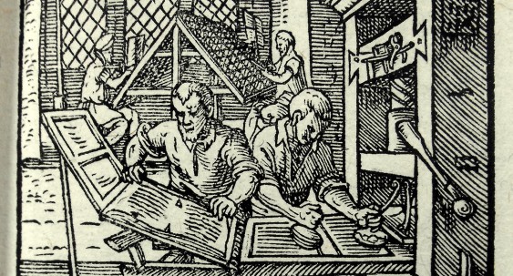
Occasionally, I field questions from site visitors about various aspects of printing history. I generally reply by email sharing what I can on the subject and then direct them to other sources. Here’s a query that our readership should be able to answer.
… how much time it would take to set a book in type and print it in seventeenth century Europe?
APHA is pleased to announce a new digital index for our flagship journal, Printing History. At the request of James P. Ascher, Vice President of Publications, and with the assistance of website Editor-in-Chief Paul Moxon, librarian and scholar Joseph Grobelny developed a completely new index to the journal. [Read more]
Interior spread of Shakespeare’s Sonnets, one of the 39 volumes of the Letterpress Shakespeare, published by The Folio Society, London. Source: foliosociety.com
In Mark Twain’s The Prince and the Pauper, the Great Seal of England was used as a nutcracker by the impostor prince. It sometimes feels like we use the heritage of the past in a similar way. It does solve the problem at hand, yet it could do considerably more. [Read more]
Two masters: Theodore Low De Vinne and Stan Nelson. Photo by Paul Romaine.
There was plenty of printing history all over town during the first few days of April. The main attraction was the New York Antiquarian Book Fair from the 3rd through the 6th. But there was also a demonstration at the Grolier Club by type historian Stan Nelson, timed to go with the De Vinne exhibit there, curated by Irene Tichenor [APHA president 1998–2002] and Michael Koenig. And then, for current practitioners and collectors of letterpress, there was a Fine Press Book Fair (sponsored by FPBA) at the Altman building on Saturday and Sunday. [Read more]
This fragment was discovered after removing the old packing on the tympan of the Kelmscott/Goudy Albion Press.
The Kelmscott/Goudy Albion press arrived at RIT on January 13, 2014. It had been expertly packed and carefully shipped 300 miles from Manhattan to Rochester, making what would hopefully be its last long-distance journey. The press has received a warm welcome at the Cary Graphic Arts Collection, with classes, friends, and reporters visiting to catch a glimpse of the famous machine, even while still disassembled. [Read more]
Samuel A. Jacobs was an American printer and a book designer. His work during the 1920s and 1930s placed Polytype Press and, later, Golden Eagle Press among elite modernist limited-edition printing establishments. Over those years, the American Institute of Graphic Arts selected a dozen of Jacobs’s books among its annual “Fifty Books of the Year.” Glenway Wescott’s Natives of Rock (1925) was one such book, the Covici-Friede edition of Chaucer’s Canterbury Tales (1930) was another. [Read more]
It was the June of 1993 and the Amalgamated Printers’ Association Wayzgoose was in Keithsburg, Illinois. A very small, rural community on the Mississippi River. So small, in fact, that there were no motels/hotels within a half an hour’s drive. The deal that year was that folks could come and camp, or rooms and cabins in town would be rented out for the weekend to the adventurous. Nearly everyone went that route. [Read more]
Designed by architect George Fletcher Babb, this device was first used it as a motif in the terra-cotta cartouche at the entrance of the De Vinne Press Building. Appearing on De Vinne Press imprints from 1886 on, it depicts a tablet bearing a saying of Prometheus in Greek: “and further I discovered for them [i.e., mankind] numeration, most striking of inventions, and composition, nurse of the arts, producer of the record of all things.” This color version is from the title page of the De Vinne Press 1907 type specimen.
No one has earned a place in the annals of American printing history more solidly than Theodore Low De Vinne (1828–1914). His encyclopedic understanding of the craft, his advancement of its technology and design, his appreciation of its history, his business leadership, and his many writings earned him, among his contemporaries, the designation “Dean of American Printers.” [Read more]