Printing Conflict: The Civil War

Christine Garnier (Robert McCamant)
 Saturday, October 7, 1:30-3:15 pm ★ James Berkey, “Controlling the Press, Losing the Battle: Ambiguity, Agency, and Print in Civil War Soldier Newspapers” ★ Joshua Brown, “Rise and Fall: Political Cartoons, Caricature, the Civil War, and the Transformation of Visual Satire” ★ Christine Garnier, “Assembling the Runaway: Self-Liberation and Visual Games of the American Civil War” ★ Kate Phillips, “The Topsy-Turvy Networks of Civil War Era Illustrated Envelopes”
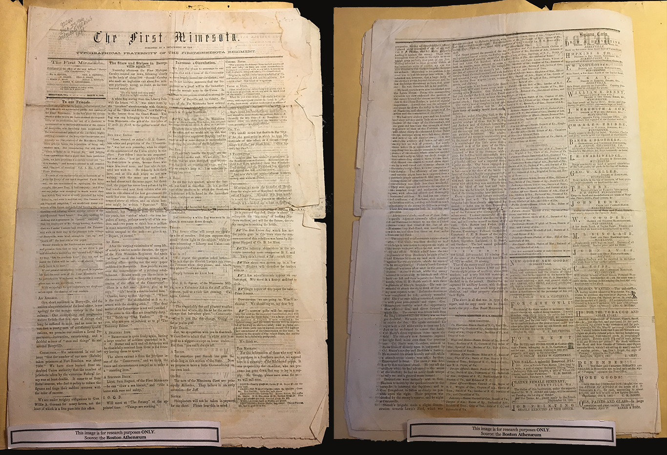
The First Minnesota, March 11, 1862, recto and verso: With limited time in Berryville, Virginia, soldiers in the First Minnesota regiment published their regimental sheet on the press of the Berryville Conservator on March 11, printing it on the backside of an already-printed Berryville Conservator front side, dated March 12. Despite this symbolic claim to Confederate space, the First Minnesota page quickly found itself surrounded by three pages of Confederate news as the Union printers in their haste also printed the already-set third page of the Conservator next to their own Union sheet. (Boston Athenaeum)
Wars of words are as old as print, or older, and the press has often played a role in armed conflict. James Berkey’s presentation, soldier newspapers of the Civil War brought to our attention an instance where the printed page itself became a material battlefield. Setting the scene with eyewitness accounts of Union troops taking control of abandoned printing offices in the wake of Confederate retreats, Mr. Berkey described how on certain occasions, a regiment’s printers would be inspired to issue their own newspaper, using the captured type and presses. His analysis focused on the March 12, 1862, issue of The Berryville Conservator, which morphed on March 11 (sic) into The First Minnesota regimental newspaper, following a Union takeover of the small Virginia town. The First Minnesota’s “typographical fraternity” seems to have been entirely aware of the military character of their enterprise, backing up half-finished Conservator sheets with their own masthead, news of the Union advance, and jokes at the expense of Berryville’s fleeing denizens. The new proprietors worked off unprinted type left standing in the Conservator’s galleys, recomposing columns and inserting derisive commentary— in Mr. Berkey’s words, “taking aim with their composing sticks at the original matter abandoned in the field of print.” After Berryville, the First Minnesota saw no further issues, though it should be noted that the First Minnesota saw action at Antietam and Gettysburg, becoming newsworthy copy themselves in the end. But their battlefield paper (or paper battlefield) remains, and Mr. Berkey took us forward, into the “slow time of the archive,” where the varied ways surviving copies have been curated and catalogued can produce ambiguous readings of the supposed Union victory. In the first issue, for instance, it is not at all clear which newspaper we are reading, since the sheet may be folded to give precedence to either masthead, or even cut in two to produce separate broadside newssheets. The dates are no help, but induce a sense of vertigo, as the announcement of the First Minnesota’s seizure on March 11 appears to antedate the ads for fugitive slaves and anti-Lincoln rants on the Conservator’s March 12 pages—as though Berryville were continuing merrily in its secessionist ways right under Union noses. Though familiarity with nineteenth-century newspaper practices will suggest a solution to the dating conundrum, the Union printers appear to have lost the battle, although they claim to control the field. Archivally speaking, print and page have “material agency” here, and the “dead matter” is never at rest. What Mr. Berkey termed the “pied pages” of the Conservator/First Minnesota continue their advances and retreats, and secession sits side by side with union, slavery with liberty.

“William Newman, “A Phenomenon of Portraiture: Showing How the Chances of Success Affect the Features of a Presidential Candidate in the Eyes of His Friends,” Frank Leslie’s Budget of Fun, December 15, 1860.” (HarpWeek)
Joshua Brown turned our attention to a more familiar battlefield of print culture, the political cartoon, and to the transformation it underwent during the Civil War period: the “waning” of the lithographic print and the “waxing” of the wood engraved cartoon periodical, as vehicles of persuasion and attack. Dr. Brown demonstrated through his slides how the change involved both the medium and the means of distribution, but more importantly, the ways in which politicians were represented. The earlier form, the broadside cartoon or print, had been around since the early years of the Republic, but had not found a large audience until the bitter presidential contest in 1828 between John Quincy Adams and Andrew Jackson. Unlike the great Georgian political prints familiar to this viewer, which exploit comic gesture and skewer the high and mighty with caricature, the American broadside cartoon presents its satirical targets in “histrionic” poses, assembled in “flat theatrical tableaux,” with dense columns of speech balloons issuing from iconic faces. Dr. Brown suggested here the influence of portrait photography, which fixed the appearance of public officials in the popular mind. When caricature does appear, it is reserved for the masses, stereotyped for ready identification by class or other groupings. But the political broadside print was only one genre among many produced by the burgeoning lithographic industry, best known through the work of Currier & Ives; it was a little shocking to learn that the firm associated with the flowering of “American democratic art” could produce a vicious anti-Lincoln satire featuring a microcephalic black man. Dr. Brown was quick to point out that this sort of cartoon held a different public space than the sleigh rides and scenic disasters one associates with Currier & Ives: political prints were too indelicate for household display, circulating instead in the all-male domains of the saloon and club. However, the lithographic publishers and their artists were generally apolitical, working for whatever party or campaign paid the bill.
Enter Fort Sumter and a new cartooning medium, the wood engraving, which came to replace the lithographic broadside as the dominant medium for visual satire. Like the lithographs, these were produced mainly in the Northeast centers of commerce and culture, New York in particular, but the artists working in each medium formed distinct groups, the new cartoonists including many immigrants from Great Britain. Their work was featured in pictorial magazines such as Vanity Fair and the many journalistic ventures of publisher Frank Leslie—his Illustrated Newspaper, and his comic monthly Budget of Fun and persuasions found a vehicle in the humor periodicals, which included the distinctly unfunny Secessionist Southern Punch. However, Dr. Brown argued that the humor magazines were more committed to their causes than the commercially driven lithographs, addressing the “national emergency” of the war with a promptness the latter failed to muster. Formally, too, the wood engraved cartoons differ from their lithographic counterparts: the tedious speech balloons have given way to brief captions that rely on the reader’s familiarity with the news. Dr. Brown finally pointed to a transformation in the uses of caricature: the faces and bodies of public officials are now subject to distortions, reflecting popular perceptions of their character. At the same time, renderings of African Americans often become less demeaning and more humanized, demonstrated in the work of radical Republican Frank Bellew. As the humor magazines played an influential role in the Civil War, one can credit these great comic artists with a change in the politics of representation, as well as in the representation of politics.

Detail of Henry Louis Stephens and James Queen, “Make Way for Liberty!”, Journey of a Slave from the Plantation to the Battlefield, 1863. Chromolithographic Print. (Harvard Art Museums)
In recent years we have seen several notable translations of pre-Civil war slavery narratives into other literary forms and visual media, such as Colson Whitehead’s Pulitzer Prize-winning fantasy novel, The Underground Railroad, and the 2013 film 12 Years a Slave, based on Solomon Northup’s 1853 account of his captivity and escape. But Christine Garnier’s presentation demonstrated just how far back the “assembling of the runaway” in other media began, and how the material processes involved influenced both narrative and visual representations. Case in point: “Journey of a Slave from the Plantation to the Battlefield,” a set of chromolithographic trading cards created by artist Henry Louis Stephens in 1863, at the moment in the Civil War when the role of black Union recruits in battle was coming to the attention of the public. While the first eight cards the series, charting the protagonist’s progress from slavery to freedom, draw on those familiar fugitive narratives, the last four of the twelve card set take the story arc forward, to his transformation into enlisted Union soldier, and, finally, his self-sacrifice in the cause of Liberty and Union. Ms. Garnier suggested that one source of visual inspiration may have been portrait photographs of African American soldiers in uniform, but the trading cards remove the biographical specificity of those images, just as the twelve-stage narrative projects an archetypal rather than individual journey. What most interested Ms. Garnier, however, was that Stephens had only a year before produced a less heroic portrayal of black self-liberation for Vanity Fair: in “The New Frankenstein, A Glimpse of the Horrible Fate in Store for Jeff Davis at the Hands of the Monster Rebellion” a wood engraved cartoon, the rebellious slave appears as a muscular black “monster.” Setting aside the possibility that the conservative politics of the magazine may have dictated the negative stereotype, or that the artist’s partner in the trading card enterprise, chromolithographer James Fuller Queen, had a hand in the change to a more heroic and humanized figure, Ms. Garnier asked a more intriguing question: whether the medium of the wood engraving, with its “grammar of black and white,” played a crucial role in constructing the “dark” image of the African—both in the “Frankenstein” cartoon, and black and white illustration overall. This seems worth considering, as wood engraving, generally a white-line relief medium, does quite literally define white by the removal or “absence” of black, while everything else is represented by “degrees of darkness,” including darker skin tones. Turning to the chromolithographic process, Ms. Garnier suggested that this new form of “color separation” could disrupt that binary fixity, opening a “space of imagination” for the representation of race—just as the cards themselves “delocalize and re-order” the fugitive slave narrative. Ms. Garnier noted, for instance, how one card depicts African Americans with differing skin tones, and how white figures are similarly “colored” with a natural tint of pink; moreover, the two races share the same “shading,” a system of dots and hatching that “blurs the stable binary.” Ms. Garnier finally considered the audience—whether the intended viewer is implicated and engaged by this “game” of reconstructed narrative and image. This set of cards does not exploit objectifying humor, as some others do, but offers a heroic archetype all can identify with, a democratization of the black soldier’s individual journey. However, the “moment” represented by “Journey of a Slave” soon passed; by 1868, Ms. Garnier noted, chromolithography shows a “re-hardening of stereotypes,” and the derisive portrayals return.

Pictorial Envelope, published by E. Roberts, 1861 (New-York Historical Society)
By now we’ve watched (and listened to) Ken Burns’ Civil War often enough to think we know all about the role of letters in the conflict: the re-created voices of battle-fatigued soldiers and stalwart wives have perhaps made us forget that these letters were actual material agents in transit, on what Melville would have called “errands of life.” Kate Phillips brought this materiality vividly to the fore in her presentation on Civil War postal media—focusing not on the letters themselves, but on the illustrated envelopes that contained them and speeded them on their way. A species of ephemera that flourished during the war years, these engraved and lithographed envelopes were produced in amazing variety—some 1500 designs survive—allowing the sender to choose from a range of patriotic, sentimental, and satirical themes. However, Ms. Phillips presentation went beneath the printed surfaces into the many real and symbolic functions of correspondence during wartime, and the underlying anxieties that these illustrations might express. She thus began with an archetypal tale of postal transit and trauma, the sensational self-liberation of fugitive slave Henry Brown, who mailed himself to freedom in 1849 in a sealed packing crate. Though the container was clearly labeled “Right side up with care,” Brown was turned on his head for nearly fatal stretches of time during his 27-hour ordeal, making him a fitting emblem for all that was unstable in a House divided by slavery, and a nation soon to be divided by war. Letters and the postal system came to express a multitude of wartime gestures and preoccupations, and the “traveling images” on the illustrated envelopes speak to attendant concerns in their own language of signs, symbols, and scenic vignettes. But Ms. Phillips singled out a particular genre she sees as expressing the same de-stabilization as the Henry Brown narrative: the “topsy-turvy” prints, a rotatable double-take in which the perception of one image depends on “the absence, but not the total disappearance,” of the other. The most popular topsy-turvy envelopes involve transformations of Confederate villains or Union heroes into animals: Jefferson Davis, turned upside down, becomes a mule, and General Lyon becomes (surprise!) a lion. While acknowledging the perceptual pleasures of this game, Ms. Philips called up some of its darker aspects: transformations of man into beast, or in the case of the “topsy-turvy” folk doll, of white woman into black, suggest anxieties about racial difference and race mixing (miscegenation being, originally, a term applied to human and animal “mixing”). Reaching further, she brought in the thaumatrope, an optical toy that combines two images through the persistence of vision, and the daguerreotype, which can be turned this way and that to bring either a positive or negative image into view, at the same time its surface mirrors the face of the viewer. These threads in Ms. Phillips “topsy-turvy networks” seemed rather far afield from the illustrated envelope, until I reflected that photographs, as tokens of both absence and presence, serve a similar purpose in wartime to correspondence: photography and the postal system were analogous “space-time technologies” of the nineteenth-century, and the thaumatrope looks forward to yet another at century’s close, the cinema. Summing up, Ms. Phillips spoke of the topsy-turvy as a nexus of these many instabilities, and as an embodiment of the war itself: meeting point of the mail and the military, and transformative portal between states of existence—for these “errands of life” might speed to the dead letter office, or be found, sealed for the eyes of loved ones, on bodies of the fallen. She concluded by coming full circle back to Henry Brown, and the persistence of his trauma in print: in one abolitionist publication, the “Representation of the Box” is itself rotated sideways, the hopeful inscription “Right side up with care” tipped on its head—along with its human cargo, presumably. It struck me that the ominous crate is a sort of coffin—another kind “dead letter” that was in transit throughout the war, and in epic fashion, at its conclusion. Whitman’s vision of the coffin of Lincoln moving across a nation in mourning is perhaps the opposite and twin of Brown’s portal to deliverance, its topsy-turvy negative.
Taken together, these four presentations raised a common question—how much “material agency” inheres in the various print media, and not only in archival remains, but in the modes of production and distribution that brought them into being. Letterpress, for example, is a “classical” system founded upon a rigidly organized matrix, with little room for spontaneity, a point made the previous evening by Jennifer Chuong in her comparison between print and eighteenth-century marbling. Similarly, both stone lithography and various forms of engraving, relief and intaglio, can be nearly “direct” media in the hands of a Daumier, a Rembrandt, or a Blake, but as reproductive media, mass production dictated the parceling out of work among specialists, who interpreted the artist’s original lines and washes through mechanical grids and meshes. A new interpretive medium like chromolithography might open a space for the imagination, but perhaps only in its early stages, or in the hands of an innovator. It may also be significant, in this light, that the wood engraved cartoons of the humor periodicals were usually exact reproductions of the artist’s original lines, rather than interpretations; Frank Bellew’s work seems unrestricted by the racist “black and white grammar” of the wood engraving, maybe for the reason that his “extraordinary pencil” was his true medium, as Charles Dickens observed about him. For all these panelists, research into the processes behind these printed pages and images seems essential and may illuminate some aspects of their social uses and political impact.