Transatlantic Connections

Michael Knies presenting (Robert McCamant)
 Saturday, October 7, 3:30-5:15 pm ★ Baird Jarman, “Beaten to the Punch: Fake News Illustrations of the 1860 Boxing Championship” ★ Michael Knies, “‘American Novelties are Foolishness!’: British Judgements on the American Typeface and Printing Invasion, 1878–1890″ ★ Mathieu Lommen, “Lettering From Neo-Gothic to Art Nouveau: 19th Century American and European Lettering Manuals” ★ Rose Roberto, “(Re)Assembling Reference Books & Recycling Images: The Wood Engravings of the W. & R. Chambers Firm”
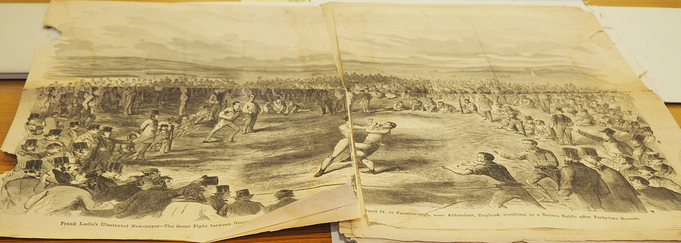
Fold-out engraving of “The Great Fight” in Frank Leslie’s Illustrated Newspaper, precise date unclear, around April 28, 1860. (Minnesota Historical Society)
Baird Jarman, after briefly discussing the contemporary notion of “post-truth” journalism, considered a case of journalistic practice from what he dubbed the “pre-truth” era in pictorial journalism. In April 1860 the first international boxing championship was held outside London. It pitted two bare-knuckle fighters, American John Heenan and Englishman Tom Sayers, against one another. The sport was illegal—considered barbaric—yet mainstream audiences well beyond the sporting-world aficionados of pugilism developed a fascination with this particular bout, which was hyped for months ahead of time in many newspapers.
Supplying timely images of the match to eager Americans posed a technical challenge—prior to the transatlantic cable steamships supplied the fastest means of delivering news from Europe. Frank Leslie’s Illustrated Newspaper claimed the honor of having provided “to the American people the first illustrated intelligence of the Great International Fight.” But New-York Illustrated News publisher J. Warner Campbell cried foul, accusing Leslie’s of using “bogus pictures” prepared before the match. Campbell had sent the nineteen-year-old artist Thomas Nast to illustrate the fight and had a wood engraver work shipboard on the return voyage to New York. Yet the Illustrated News images appeared in print after Leslie’s, in the first May 1860 issue.
Not mentioned in Campbell’s “bogus news” accusations against Leslie’s were the visual inaccuracies in the engravings. These included the use of a nondescript landscape setting and a boxing ring that matched correct technical specifications but did not correspond to anomalous arrangements reported by eyewitnesses and shown in the Illustrated News image. Jarman proposed that in this “pre-truth” era, before photographic reportage had become the journalistic norm, readers were less conditioned to expect unmediated pictorial realism. Thus arguments over the authenticity of Leslie’s questionable images hinged less upon visual accuracy and more upon the testimonial statements of known eyewitnesses.
Campbell failed in his quest to persuade publishers across the country to chide Leslie’s for falsely claiming that his prize-fight illustration—one of the most widely circulated newspaper images in North America up to that time—was sketched on location. Yet decades later one of Leslie’s engravers admitted that, aside from the central woodblocks depicting the two boxers inside the ring, the image had indeed been faked beforehand.

The Modern Printer, Vol 1 No. 2, June 1884. M. P. McCoy, Conductor.
Michael Knies discussed how this turnabout launched a lively transatlantic debate about aesthetics.In the early 1880s American innovations in type design and printing technologies began influencing British practices. Typefoundries, printers, and trade journals argued over the appropriateness of these “novelty” types—elaborate designs made possible by electrotyping—and about the adoption of technologies that allowed them to be printed to best advantage, hard packing and dry printing on calendered paper.
The Mackellar, Smiths, & Jordan typefoundry in Philadelphia was the first to export ornamental letters, type that could be composed to make exotic pictorial scenes, and other elements used in “artistic printing.” The new types were reviewed by trade journals with both excitement and ridicule. A cartel of five long-established British typefoundries were resistant to change: “American novelties are foolishness compared to the chaste types,” and “an American specimen book wouldn’t be American if it didn’t have its typographical chamber of horrors.” Yet customers wanted the novelties and their impact on periodical and job printing design and production was notable.
By the late 1880s most of these printing technologies advanced in America had been adopted in Britain. Even as the aesthetics of artistic printing finally fell out of general favor on both sides of the Atlantic by the late nineteenth century—“Ugliness of design with the most excellent workmanship”—the technologies adopted in this era became those used by the growing periodical press.

Mathieu Lommen’s richly illustrated presentation focused on ten lettering manuals chosen as representative of their overall content and production. Lettering manuals published during the nineteenth century provided specimens of calligraphy, drawn lettering, and display types. They were intended as models for students of penmanship and as tools for professional artists, sign painters, engravers, illuminators, cartographers, and architects.
Manuals such as Jean Midolle’s, Spécimen des écritures modernes (1834, Strasbourg) were printed using stone lithography, which allowed for a ‘new language of letterforms,’ as lettering artists adopted lines that broke free from rectangular type metal.
Becker’s Ornamental Penmanship: Analytical and Finished Alphabets (1854, Philadelphia) by George J. Becker, a professor of drawing, writing, and bookkeeping, who “endeavored to raise Penmanship from an art to a science,” modeled 33 designs with plates made by steel engravers.
A “deliberately quite cheap” manual published in 1859 by the British wood engraver Freeman Delamotte featured letterpress printed engravings of ornamental alphabets, “ancient and modern,” was in such great demand that it was in print for many decades.
Chromolithography allowed lavish multi-color editions, such as the Midolle manual and the c. 1900 manual by the Parisian sign painter Louis Ramade, Nouveau recueil pratique d’enseignes décoratives à l’usage des peintres, which includes a spectacular dimensional title page printed in at least twelve colors. In America, chromolithography was used to great effect in the 1886 edition of Prang’s Standard Alphabets, published in Boston by Louis Prang.
Lommen considers these manuals to be understudied as well as under-collected by librarians. Today these often ephemeral model books are valuable research material, as well as exemplars for current practitioners reviving historical lettering, such as the Dutch Curly Letter Lommen has observed painted on Amsterdam pub windows.

Marmoset electrotype from W. & R. Chambers collection. Image appears in Chambers’s Encyclopaedia, 1888-1892 and A Course in Zoology, 1911. (Photo by Rose Roberto courtesy of National Museums Scotland)
Rose Roberto discussed the evolution of both content and production in nineteenth-century reference works published in the United Kingdom and the United States. She focused on the Scottish firm W. & R. Chambers, established by brothers William and Robert in 1832. The brothers had worked both in bookselling and printing and brought efficiency to publishing reference works—they used up-to-date technologies and knew what content would sell. The first edition of the Chambers’s Encyclopedia took eight years to complete and was published in ten volumes. Chambers partnered with the American publisher J.B. Lipincott for simultaneous UK/US release of their second edition.
What changed between editions? Tables and charts replaced some pictorial images—a half-page wood engraving accompanying the entry for Agriculture was replaced by a table showing oat, wheat, and barley production. This likely saved money and also gave the appearance of including more facts. Technology and workflow changes are also apparent. Chambers’ first edition was printed from type and wood engravings, and the second from electrotypes on perfecting presses. First edition images, created in the mid-century, have a pictorial or artistic style. In contrast, second edition illustrations tried to imitate the style of photographs. Roberto’s analysis of images shows that vertebrates made up 15 to 18 percent of encyclopedia images overall,with other popular categories frequently illustrating medica
Reference books tend to illustrate the same things and Roberto showed examples of text and images shared and/or pirated among publishers. To prevent piracy of images, Lippincott was asked to destroy the Chambers’ plates after printing, though existing paperwork shows Lippincott also had agreements to reprint some plates in science books. Encyclopedia text and visual materials were valuable commodities for publishers.