Detail from Gautier (d’Agoty) and Duverney “Muscles of the head” from Myologie complete en couleur et grandeur naturelle(Paris, 1746). Wikimedia
Why color? For keynote speaker Sarah Lowengard, whose research hangs at the intersection of scientific theories and technological processes in eighteenth century Europe, the answer is in its multiple meanings. Color is both concept and process, and is therefore a significant framework for looking at that modernizing culture’s art, materials, and technology of making. In a similar vein, Lowenberg posited an overarching question about aesthetics, technology, and science: How do we make something beautiful, but lasting? [Read more]
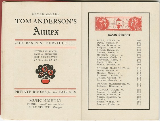
“The Historic New Orleans Collection, 1969.19.9_p8,9
Storyville, a neighborhood in New Orleans, was an infamous red light district mandated by city ordinance in 1897. The area spanned several blocks and represented a way for the authorities to keep an eye on legalized prostitution.
Seven color letterpress ruler from Maret’s forthcoming book, Interstices & Intersections.
Russell Maret makes letterpress prints that originate from his paintings, which he uses as sketches. His prints maintain a painted look—those subtle transitions in color and shading—through a painstaking process of scanning, drawing separations, preparing negatives and plates, mixing inks, and printing layer upon layer of carefully chosen and expertly registered hues. Maret shared his techniques, developed particularly since 2008 it would seem, when someone said about his muted color map in Mediaeval in Padua, “Nice book, Russell, but use more colors.” [Read more]
A 1950s belle, with and without the use of a hand-cut color separation correction mask for her green dress.
Up until 1978, the National Geographic Magazine printed millions of copies every month of their famous yellow-bordered magazine by four-color process letterpress. The distinctive look of the color photo reproductions in the fifties and sixties was partly due to the medium of four-color letterpress and partly due to the state of separation technology at that time. Modern practitioners of letterpress find it hard to believe today that those millions of copies of the National Geographic Magazine were printed by letterpress. [Read more]
George Catlin’s North American Indian Portfolio, Plate No. 5, Buffalo Hunt, Chase.
In her survey of landmarks in ethnographic color printing, Rebecca Romney demonstrated that they all went big. And rather than go home, some authors and artists went into the field to record tribes of North American that were vanishing as the result of westward expansion and the devastating Indian Removal Act under President Jackson. [Read more]
The Master Silk Printer, New York: Oriental Silk Printing Co., 1922-1927 (Watson Library Special Collections – 156.41 M39)
The Thomas J. Watson Library at the Metropolitan Museum of Art comprises over 800,000 volumes focused on art documentation (just one of almost thirty specialized libraries at the Met). Our host, Jared Ash, discussed the significance of approximately fifty color illustrated books, folios, magazines, and trade publications, all of which were displayed for conference goers on well-spaced tables, enabling us to carefully turn pages and take many digital photographs. [Read more]
This 1905 $20 Gold Certificate (along with similar $10 and $50 designs) was authorized by Act of Congress in 1882. Reissued with minor modifications in 1906 and 1922, they remained in circulation until 1933.
Historical consultant Alan Levitt presented dozens of remarkable images, some quite beautiful, of printed American currency—colonial, state, federal, Confederate and private banknotes, and various payment certificates—to emphasize the historical importance of the use of color in deterring counterfeiting. [Read more]
Kenn Lubin of King Displays with some die cutting leftovers.
On Friday, October 18, Kenn Lubin, head of operations and sales of King Displays, led an interested group of APHA members on a tour. Located a block from the Neil Simon Theater in Manhattan, the printing company has been around since 1938, when it began creating signs for burlesque shows. Over time the business grew, taking on movie work, Broadway scrims, and eventually producing 98% of the signs on Broadway. [Read more]
From Naughty Girl’s and Boy’s Magic Transformations (McLoughlin Brothers, ca. 1880).
On the Friday afternoon before the conference started, there was a special treat prepared by Jane Rodgers Siegel, Columbia University’s Librarian for Rare Books (and also one of the conference presenters). In the Rare Book & Manuscript Library on the sixth floor of Columbia’s Butler Library she laid out examples of books encapsulating the history of color printing from the fifteenth through the early twentieth centuries, and illustrating topics from many of the conference presentations. [Read more]
CMYK+W print heads for the large format WireJet printer. (Removed from printer carriage for cleaning)
On Sunday after the conference, a group of nearly twenty people visited Ribuoli Digital a fine art digital and traditional print and fabrication studio for artists and photographers located in the far west of Chelsea. Proprietors Andre Ribuoli and Jennifer Mahlman-Ribuoli showed prints and machines for reproducing artwork and creating new artwork. Ribuoli started doing their own artwork and have since begun working as jobbers for other artists (some quite well-known). [Read more]


