Reclaiming S.A. Jacobs: Polytype, Golden Eagle, and Typographic Modernism
Samuel A. Jacobs was an American printer and a book designer. His work during the 1920s and 1930s placed Polytype Press and, later, Golden Eagle Press among elite modernist limited-edition printing establishments. Over those years, the American Institute of Graphic Arts selected a dozen of Jacobs’s books among its annual “Fifty Books of the Year.” Glenway Wescott’s Natives of Rock (1925) was one such book, the Covici-Friede edition of Chaucer’s Canterbury Tales (1930) was another.
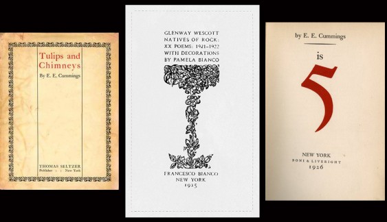
In particular, Jacobs’s standing in the trade reflected his work on behalf of prominent modernist poets and writers, groundbreaking Greenwich Village literary figures such as Marianne Moore, Hart Crane, Gorham Munson, and Eugene O’Neill. A long collaboration with the poet E.E. Cummings became the most important of those relationships. Beginning with Cummings’s first book of poems, Tulips and Chimneys (1923), Jacobs designed and printed all of Cummings’s poetry. He was Cummings’s “personal printer.” In books ranging from Cummings’s is 5 (1926) to No Thanks (1935) Jacobs established a fresh, new American page design. Jacobs’s use of san serif type, an asymmetric page, and white space complemented Cummings’s visual poetic radicalism. The Jacobs-Cummings collaboration significantly defined typographic as well as literary modernism.
Seltzer
Thomas Seltzer smoothed that collaboration. Seltzer was the Manhattan publisher who, in 1923, issued Tulips and Chimneys. The book was E.E. Cummings’s debut volume of poems, and it’s widely famous. Much of that fame derives from its departure from verse as verse had been known. Cummings’s poems were different, often filled with concocted words and phrases as well as unorthodox typography. The differences that made those poems famous made them hard to read. They were also hard to print, a literary issue that is routinely overlooked. For that work, Seltzer found S.A. Jacobs at his Polytype Press on Manhattan’s West 8th Street. Tulips and Chimneys launched two careers.
Tulips and Chimneys, in 1923, was Jacobs’s and Cummings’s first collaboration. Thomas Seltzer made it happen. Seltzer was a Manhattan editor and translator who owned a one-third share of the publishing firm Boni & Liveright. Seltzer left Boni in 1918, accusing the firm of literary timidity. He then established his own publishing company and set out to find a literary cutting edge. By 1922, he had published a trio of salacious tales: D. H. Lawrence’s Women in Love, Arthur Schnitzler’s Casanova’s Homecoming, and the anonymous A Young Girl’s Diary, prefaced by Sigmund Freud. Seltzer thought E.E. Cummings’s manuscript of “Tulips & Chimneys” fit right in.
Seltzer knew Samuel Jacobs from the street, a neighbor in the bohemian Babel of early-twentieth-century Greenwich Village. Seltzer’s family was Russian, and he had made a living as a translator. Jacobs was Assyrian by birth, and his first employer was an ethnic newspaper called the Persian-American Courier. Separately, Seltzer and Jacobs each worked the world of immigrant literature.
Cummings
In 1922, E.E. Cummings published The Enormous Room, a tale of arrest and incarceration in World War I France. The book did well, and Cummings’s prose style attracted particular attention. Moreover, the young Cummings, driver of wartime ambulances, was brash and confrontational. That’s how he seemed to Norman Fitts, editor of the little magazine S4N. Fitts met Cummings in Paris, liked his caustic sensibility, and published some of his earliest poetry. Cummings, said Fitts, was “the vulgarest of the newer younger generation”—a pleasant thought—“and besides, a knockout of a person.’1
Maybe, but Boni & Liveright, Cummings’s Enormous Room publisher, found him less charming. The Enormous Room was an auspicious debut. Getting it into print, however, had vexed everyone. According to Cummings, Boni’s editors or printers altered his text and, worse, dropped portions of it altogether. They misplaced commas, confused “ands” and “hads,” substituted “moir” for “noir”—the list went on. Cummings accused Boni & Liveright of manufacturing the “greatest burlesque achievement of the ages.” Unless fixed, death was too good for somebody in that company.2
Cummings brought a similar edge to poetry, especially to its language. Cummings said strange things. Springtime, for instance, was “when the world is mud-luscious.” Publisher Seltzer liked Cummings’s “Tulips & Chimneys” manuscript, took what he felt he could handle, and looked for a printer. Boni & Liveright’s treatment of Cummings’s The Enormous Room had gone badly, and Seltzer understood that he needed better. Jacobs had printed within New York’s Assyrian community for a decade, gaining extensive experience with improbable prose. Both Seltzer and Jacobs were effortlessly multilingual; each was easy with difficult copy. E.E. Cummings, who lived just down Manhattan’s 8th Street in Patchin Place, provided it. The combinations clicked. Cummings, disappointed with Boni’s editorial decisions and typographical errors, was “delighted with the care Jacobs had taken with the typesetting.”3
Jacobs
S. A. Jacobs’s work on Cummings’s Tulips and Chimneys began an extended collaboration. It’s hard to say what had honed his skills. Jacobs was twenty-four years old when, in 1915, he first went to work at Joel E. Werda’s Persian-American Courier. The Courier was a bilingual news-sheet serving a Syriac diaspora, and Jacobs operated its Linotype. In the years prior to World War I, Jacobs’s family was part of an immigrant Assyrian enclave gathered around Yonkers, New York. Apparently, young Jacobs arrived with skills sufficient to serve that community. Training in rudimentary presswork and typesetting had been available at Qalla, the American Presbyterian missionary boarding school for boys in Urmia, a city in what is now northwest Iran. 4
Jacobs, however, was a Linotyper, a machine operator. Mastery of the Mergenthaler Linotype was difficult and a valuable composing skill. Jacobs must have been an early practitioner. At the turn of the twentieth century, a single first generation Linotype supplanted ten traditional hand typesetters, and fears persisted among journeymen compositors. Therefore, like other labor unions New York’s Local No. 6 of the International Typographical Union worked hard to maintain its control of shopfloor training programs, and the reach of “Big Six” was extensive. In Jacobs’s case, not extensive enough. He never served a “normal” tradesman’s apprenticeship.
It’s also difficult to assess Jacobs’s own shopfloor, how he went about his work. According to printing historian J.F. Coakley, by 1918 Jacobs had installed Mergenthaler’s Model 17 Linotype at his Manhattan shop. It was a large machine, one that used two 90-channel magazines and a 28-channel auxiliary magazine. 5 Jacobs needed the big Linotype to work the wide range of characters required of Assyrian texts. It also suggests an expanding business.
What truly set Jacobs apart, however, was the breadth of his expertise. Polytype Press, in Greenwich Village, was a type house. Into the 1930s, Jacobs’s work emphasized text composition—typesetting—over actual printing, although he did that work, as well. Ordinarily, he set pages in type and others, elsewhere, printed them. This is work for hire, contracted labor that a publisher might commission and journeymen shopfloor printers accomplish. Jacobs was good at it, of course. According to Pascal Covici, the New York publisher, whenever Jacobs was in charge of setting up a book, the firm ceased worrying about it.6
But such praise merely indicates competence, and Jacobs’s skills quickly exceeded proficiency. Between the initial Tulips and Chimneys project of 1923 and the end of the 1920s, Jacobs became far more than a hired hand. The poet (and client) Charles Norman called Jacobs “Cummings’s friend, explainer and defender.” Interviewers went to him “to learn something about Cummings.” 7 By the mid-1930s, Time magazine was calling Jacobs Cummings’s “Persian pressagent.”8
By that time, S. A. Jacobs had moved his establishment from Greenwich Village to suburban Mount Vernon, New York, and he renamed it Golden Eagle Press. E.E. Cummings remained a meal ticket. Eimi (1933), a Russian travel narrative, and No Thanks (1935), a poetry collection, were the poet’s culminating achievements, and Jacobs handled both. By these and other projects, Jacobs contributed a new look to graphic design. Further examples of Jacobs’s typographic modernism include Carl Heinrich’s Orphan of Eternity, Joseph Kling’s A Full Life, Sven Hedin’s A Conquest of Tibet. The reputation of Jacobs’s Golden Eagle Press crested during the 1940s with books such as these. Jacobs printed at Golden Eagle into the 1960s.
- 1 S4N23, summer 1923, np. See also Walker Rumble, “Space for Name: Printing a 1920s Little Magazine” in The Massachusetts Review, Summer (Vol. XLVIII, No. 2) 2007, 259.
- 2 Quoted in Christopher Sawyer-Lauçanno. E.E. Cummings: a biography (Naperville, Ill.: Sourcebooks, 2004), 202.
- 3 Sawyer-Lauçanno. E.E. Cummings: a biography, 241.
- 4 J. F. Coakley, The Typography of Syriac: A historical catalogue of printing types, 1537-1958 (New Castle, Delaware, and London: Oak Knoll Press/British Library, 2006), 251.
- 5 Coakley, Typography of Syriac, 257.
- 6 Charles Norman, The Magic-Maker (New York: Bobbs Merrill, 1972), 287.
- 7 Norman, Magic-Maker, 172.
- 8 “Art: Poet&p( aiNT)er” in Time Magazine, December 14, 1931 http://www.time.com/time/magazine/article/0,9171,930051,00.html?iid=digg_share

