Font or Fount?
“Font” as a misnomer for “typeface” is a modern usage that arrived with the digital era. Perhaps the wider appreciation of a choice of typefaces, once people became tech-savvy, led to this more sophisticated-sounding term coming into use. In printing terms, a font means a whole set of one size of metal type, and is sometimes referred to as a fount.
Going back to the fons et origo, Samuel Johnson’s A Dictionary of the English Language (rev., cor., and enl., 1827), we learn:
FONT. A stone vessel in which the water for holy baptism is contained in the church. In printing, An assortment of letters and accents.
Under FOUNT he gives “a well, a spring; first principle.” So Dr Johnson opts for font and does not offer fount as an alternative.
Joseph Moxon (“Hydrographer to the late King Charles”) wrote the first practical guide (in English) to printing, called Mechanick Exercises: or, the Doctrine of Handy-works, London, 1683. Describing the setting up of a printing-house, he says (page 13),”
¶. 2. Of Letter. He provides a Fount; (properly a Fund) of Letter of all Bodies.”
Here we have the origin of the term, which doesn’t come from the founding, or casting, of letters but from a sufficient supply (funds) for the printer’s needs. Later (p. 172), Moxon adds, “But besides Letters, there is to be Cast for a perfect Fount; (properly a Fund) Spaces Thick and Thin, n Quadrats, m Quadrats and Quadrats.” Again, he stresses the concept of a fund. However, the Oxford English Dictionary gives several definitions of font, including the action or process of casting or founding from the French fondre.
Under “fount,” the first meaning is a poetic usage of “spring or source,” secondly we have “printing, also Found or Fund: a complete set of type of a particular face and size, also fully, a fount of letter or type.”
The O.E.D.’s first citation is Moxon. Their second source is Robert Boyle’s Letters from 1687: “I caused a font of Irish letters to be cast.” Boyle was the scientist for whom Boyle’s Law is named. Seeing the need for religious works in his native tongue, Boyle hired Moxon (admittedly a second-rate punchcutter) to cut a small pica Hibernian, first used in a catechism printed in London in 1680.
Back to our sources — Bernard Mandeville in Fable of the Bees, 1724, asserted,
“Would you banish fraud and luxury, prevent profaneness and irreligion, and make the generality of the people charitable, good, and virtuous; break down the printing presses, melt the founds, and burn all the books in the island.”
Philip Luckombe’s History of Printing, 1771, refers to “A complete fount of letters.”
The erudite Robert Southey, a frequenter of print-shops, makes an entry from his Doctor of 1834 (which includes expressive typography in his story of the Three Bears): “We discussed the merits of a new font.” Let me expand this quote:
“It was once my fortune to employ a printer who had a love for his art; and having a taste that way myself, we discussed the merits of a new font one day when I happened to call in upon him. I objected to the angular inclination of a capital italic A, which stood upon its pins as if it were starting aghast from the next letter on the left, and was about to tumble upon that to the right; in which case down would go the rest of the word, like a row of soldiers which children make with cards. My printer was too deeply enamoured with the beauties of his font to have either ear or eye for its defects; and hastily waiving that point he called my attention to a capital R in the same line, which cocked up its tail just as if it had been nicked; that cock of the tail had fascinated him. “Look, sir,” said he, while his eyes glistened with all the ardour of an amateur; “look at that turn! — that’s sweet, sir!” and drawing off the hand with the fore finger of which he had indicated it, he described in the air the turn that had delighted him, in a sort of heroic flourish, his head with a diminished axis, like the inner stile of a pentagraph, following the movement. I have never seen that R since without remembering him. ** *** ** ****** *** ******** ** ******** ******* ** ******* *** ********* ***** *** *** ** *** ******* ***** ** ********** *** *** *******. He who can read the stars, may read in them the secret which he seeketh.”
From 1862, we have John Hill Burton’s Book-Hunter: “The largest font of Italics possessed by the establishment.” This is intriguing, yet I can’t find that exact quote in his book; instead, we learn, “having increased my stock to eight small fonts, roman and italic, with the necessary appurtenances, I placed the whole in a cottage.” This however, is a quote from T. F. Dibdin’s Bibliographical Decameron (1817, ii, 454, which contains a dozen references to ‘founts’) where he is describing the Auchinleck Press of Sir Alexander Boswell. Sir Sandy was the son of Johnson’s Jamie Boswell, but “he was about as like to his father as an eagle might be to a peacock.”
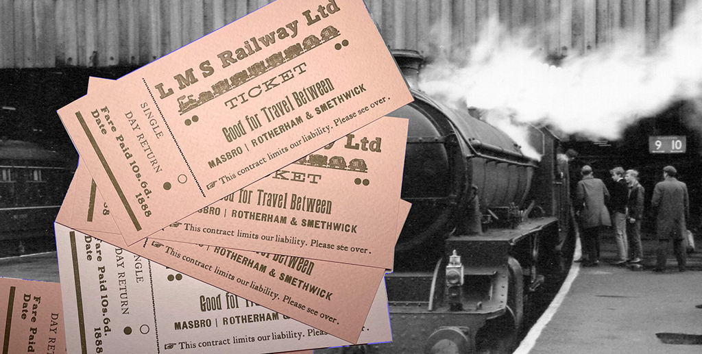
Lastly (and don’t be surprised because we know how varied the sources for the OED are), we hear from The Midland Railway: its Rise & Progress by Frederick Williams, 1888: “He set up a complete fount of type.” Thanks to the Internet Archive, we can expand on this quote:
“He devised a plan for travelling cheaply. He set up a complete fount of type, composing stick, and every requisite for printing tickets, and provided himself with coloured papers, colours and paints to paint them, and plain cards on which to paste them; and he prepared tickets for journeys of great length, and available to and from different stations on the London and North Western, Great Western, and Midland lines. On arriving one day at the ticket platform at Derby, he presented a ticket from “Masbro’ to Smethwick.” The collector, who had been many years in the service of the Company, thought there was something unusual in the ticket. On examination he found it to be a forgery; and when the train arrived at the platform he gave the passenger into custody. On searching his house upwards of 1000 railway tickets were discovered in a drawer in his bedroom, and the apparatus with which the forgeries were accomplished was also secured.”
I can add three more early English sources from my own research: John Wilkins in the Preface to his Grammar of the Sanskrita Language, printed by Bulmer for the author, 1808, writes, “I cut letters in steel, made matrices and moulds, and cast from them a fount of types of the Devanagari character, all with my own hands;” Caleb Stower, in The Printer’s Grammar (1808), uses “fount” throughout, but I also came across “font” in John Haddon Hindley’s 1799 translation of Persian Lyrics. In the Address to the Reader (page 50), he writes,
“It is, however, but justice due to Messrs Wilson & Co here to mention the very laudable exertions made at their Oriental Press in London, in order to facilitate the publication of Eastern Works: A new font of Persian type is, we understand, nearly completed at their own expense.”
A quick tally gives us:
Fund: Moxon
Found: Mandeville
Fount: Moxon, Luckombe, Stower, Williams, Wilkins, Dibdin
Font: Johnson, Boyle, Hindley, Southey, Burton
Six to five in favor of fount (in books printed in England).
In Typographical Printing-Surfaces: The Technology and Mechanism of their Production by Lucien Alphonse Legros and John Cameron Grant (London: Longmans, Green, 1916), we learn “a fount—pronounced font, and so spelt in America,” thus establishing the trans-Atlantic divide.
As we know, the Americans, since Webster, are keen to expunge traces of Anglo-French orthography from English, so colour becomes color; parlour becomes parlor. Some British and most American writers adopt the abridged form of the word. Updike and DeVinne prefer “font” unless they are quoting a British source. I believe Cicero talked about arguing a point that is already established. [Illa autem altera argumentatio, quasi retro et contra, prius sumit quae vult eaque confirmat, deinde id quod proponendum fuit permotis animis iacit ad extremum.— Cicero, De Partitione Oratoria]