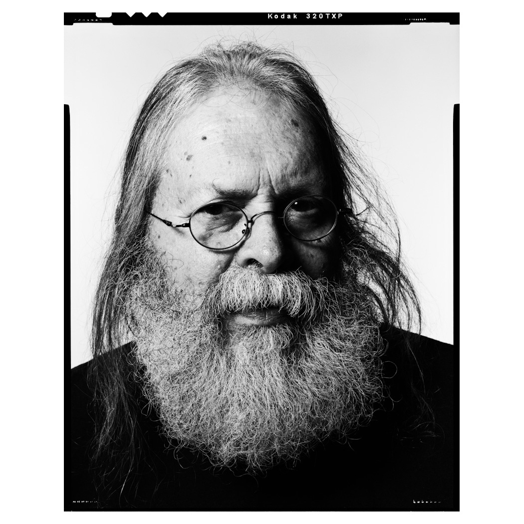
Ray Nichols was the head of the Visual Communications Group at the University of Delaware before retiring from University teaching in 2006. He had led the Advertising Design program to national prominence, ranking among the top 20 programs in the United States while also being the smallest in enrollment. During a London study-abroad session in 2002, he took two dozen students to the St. Bride Printing Library, where the head librarian pulled 10 items from the collection that he felt students should know about but rarely saw. One of those was the book printed via letterpress by Ian Mortimer, titled “Ornamented Types.” The 10 minutes taken up looking at specimens of the 23 elaborate typefaces Pouchee turned out to be a life-altering experience and is the reason Lead Graffiti exists today. Photo by Craig Cutler.
When printing on Vandercook presses, it is often convenient to start the clean-up process by running several sheets of waste paper through the rollers to remove as much ink as possible as quickly as possible. Over time, we started developing a bit of a technique (you can’t have much) for adding solvent to help control the look and fell in love with the liquid texture we often got. We started using better, thicker paper, which we would double-up through the press to keep the backs of the sheets cleaner and then use as stock for broadsides and small blank notebooks (see the 5th project below).
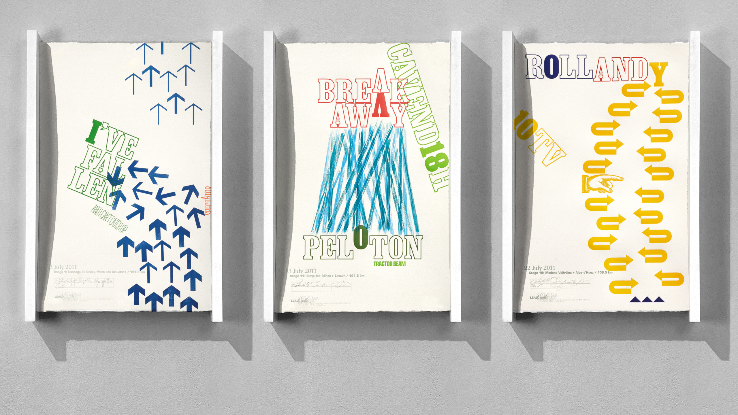
We loved the Tour de France, admiring the riders’ endurance and watching it live on TV each year for years. We spent about 5 years exploring ways to merge cycling with our love of letterpress. In 2011, we began a project by watching each stage, going to lunch to talk about what we saw and how its story might be told on a broadside, and then going to the studio to make that broadside happen. Including the typical 4-hour-long stage, lunch, and studio time, we averaged just over 17 hours a day, producing 23 stage posters each year for five years. These are all from the first year.
Broadside 1 was the first of 115 stage posters we produced. A spectator stood along the side of the road with his hand on his hip. As the peloton of roughly 200 riders who were spread completely across the highway sped by, he rotated to watch, with his elbow protruding maybe 8” toward the riders. One struck him and slammed into the crowd of cyclists, probably doing 30 miles an hour. We were off and riding.
We invited friends or people we just stumbled across to join us. Almost no one knew much about letterpress and even less about the strategy of professional team cycling. In most stages, a group of maybe 2 or 3 to 20 would try to break out of the 200 riders in an attempt to launch their career forward with a stage win. Broadside 2 was an attempt to illustrate how the peloton-versus-breakaway strategy worked. We would often describe the peloton as having a rubber band attached that they could reel in as they neared the finish line. There is almost always strength in numbers. The blue and green elements of this piece are printed from rubber bands. They were stretched across a plywood panel, hooked onto small nails. We printed one color, then swapped the nail heads the rubber bands were attached to and printed the second color.
Broadside 3 was to celebrate the climb up Alpe d’Huez, probably the most classic of all the mountain stages in the tour. Alpe d’Huez is one of the Tour de France’s most iconic climbs, famous for its 21 numbered hairpin bends and massive, festival-like crowds. Spanning 13.8 km at an average gradient of 8.1% with a maximum of 13%, the climb rises to an elevation of 1,850 meters and is historically a decisive mountain finish. Each year of this project, we produced 2 typefaces in wood type. This year, it was Clarendon Bold Condensed in both solid and outline forms. Additionally, we created those 180° arrows specifically for this broadside. My creative partner, Jill Cypher, and I come from a design background and have a strong interest in creative expression through typography.
To explain our typographic interest a bit, Pierre Rolland won this stage. Rolland contains the word “roll”. Before this stage, he had never won a tour stage, hence the zero. The rider we were rooting for was Andy Schleck. While he didn’t win the stage, he took over the yellow jersey as the “leader’ of the Tour from Tommy Voeckler, who had surprisingly worn it for the previous 10 stages and had become a cycling favorite ever since.
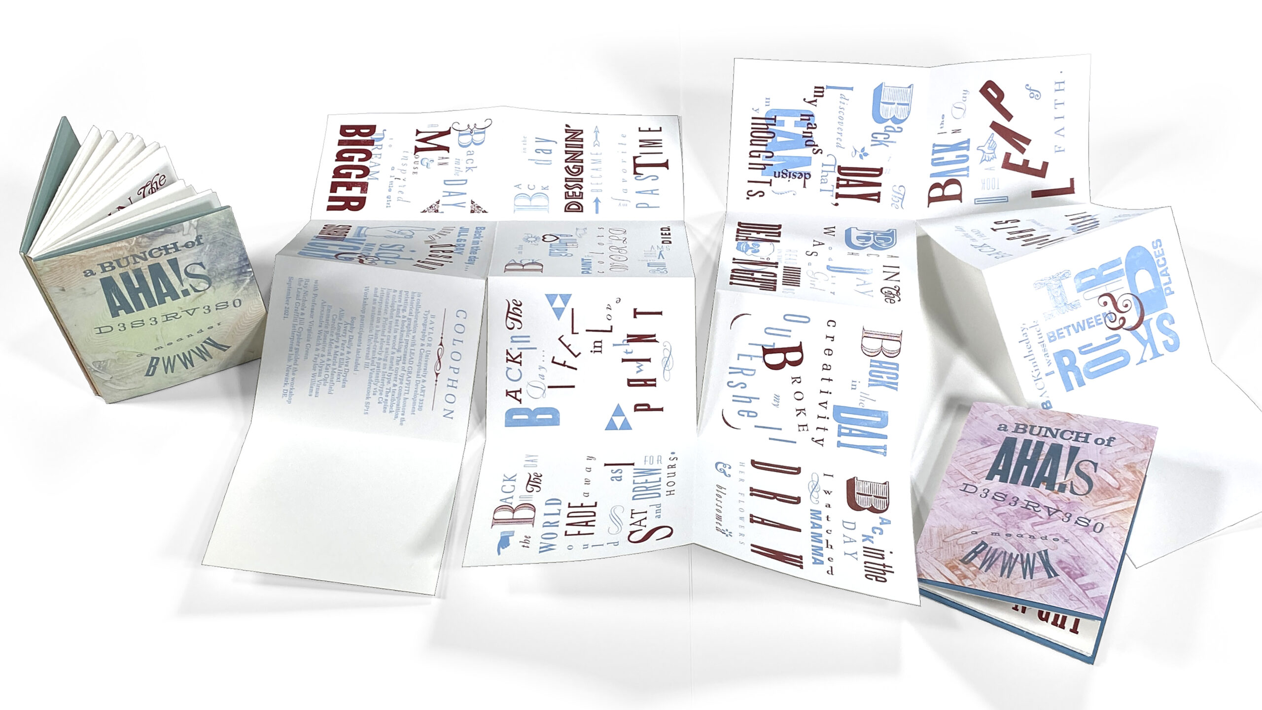
Our Meander Book Workshop is our favorite of all the workshops we have given. We’ve done it more than 60 times. This particular one was done over Zoom with 2nd-year design students from Baylor University in Waco, Texas, who were taking Typography I (and, as it turned out, their first project of the semester). An added benefit of the project offered to the students was its value to their résumés. On top of getting a great portfolio piece right out of the gate, they could add a line to their education about the workshop and the fact that their work would reside in the Rare Books Division of the Library of Congress and Special Collections at the University of Delaware library, which holds complete collections of the workshop results.
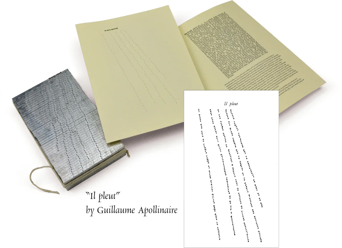
Lead Graffiti has a working Intertype linecaster. To start things out, we were always looking for things we could do with it that were outside the normal projects. We definitely didn’t want to print a newspaper. Ever since I was in my college design classes, an image that has haunted me was the concrete poem “Il Pleut” by guilliame Apolonaire typed out “sort of “diagonally on a typewriter. In the studio one day, I stumbled across a box of thin spaces for Intertype mats used to make “very” small adjustments to letterspacing in text, which has always been a design concern of mine. We were part of a group of letterpress printers that submitted work to a publication called “It’s a Small World.” There’s not much smaller than a period. So I hand-composed the mats to align a series of periods to replace the typewriter letterforms. It took me 5.5 hours to compose the piece. Here is a link so you can see where I was coming from.
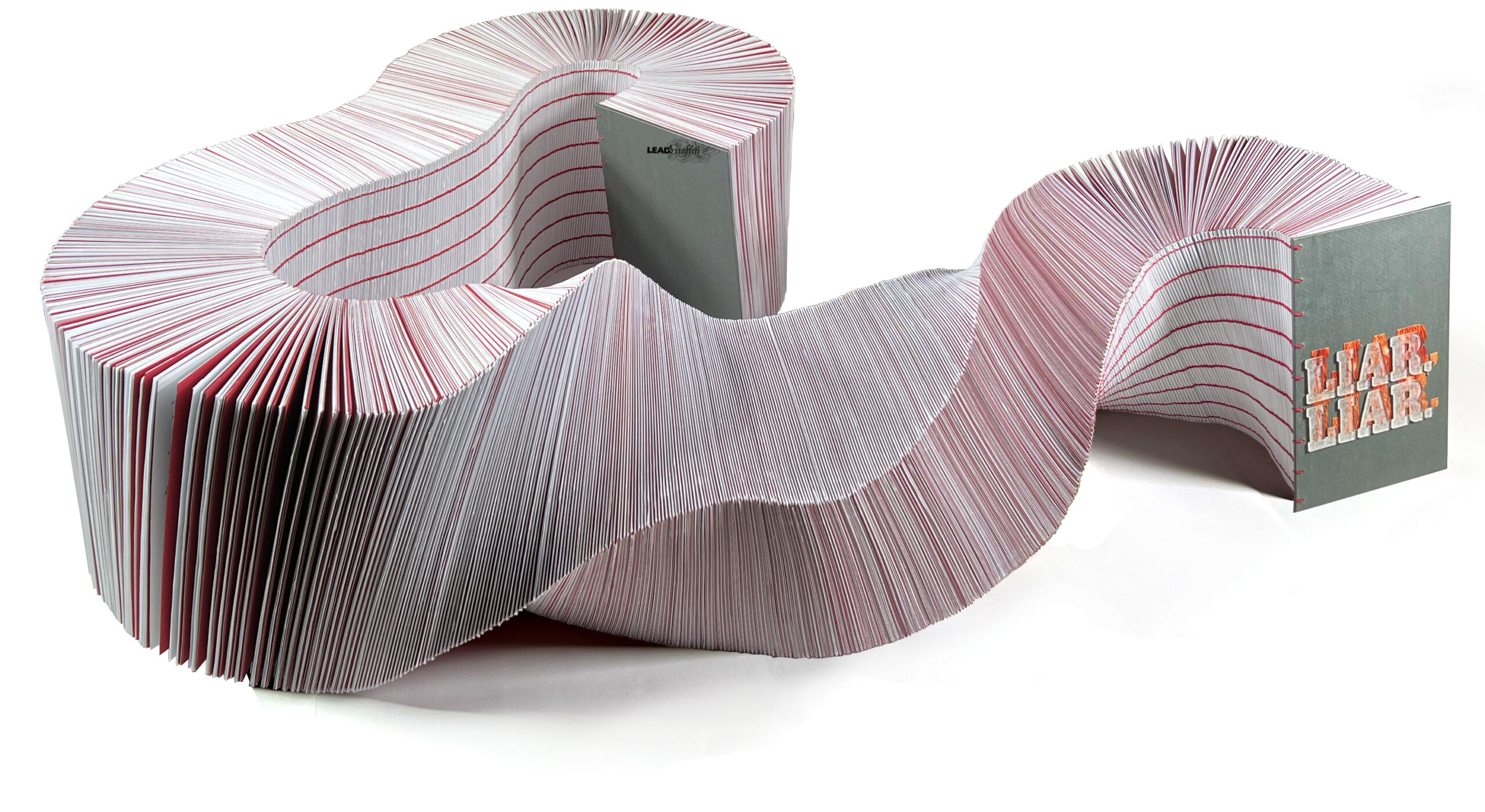
A friend showed us a student book project which was about 18” thick. It bounced around in our heads for a couple of weeks. Then the question popped in there, “What could the content be for a book 3 times as thick?” Pop again was Trump’s lies during his first term. Turns out the Washington Post kept track of the 30,000+ lies and fabrications and offered them up in a PDF. Sold. 9,626 pages, Coptic stitched, 53” spine, inkjet printed, 52 pounds. Done.
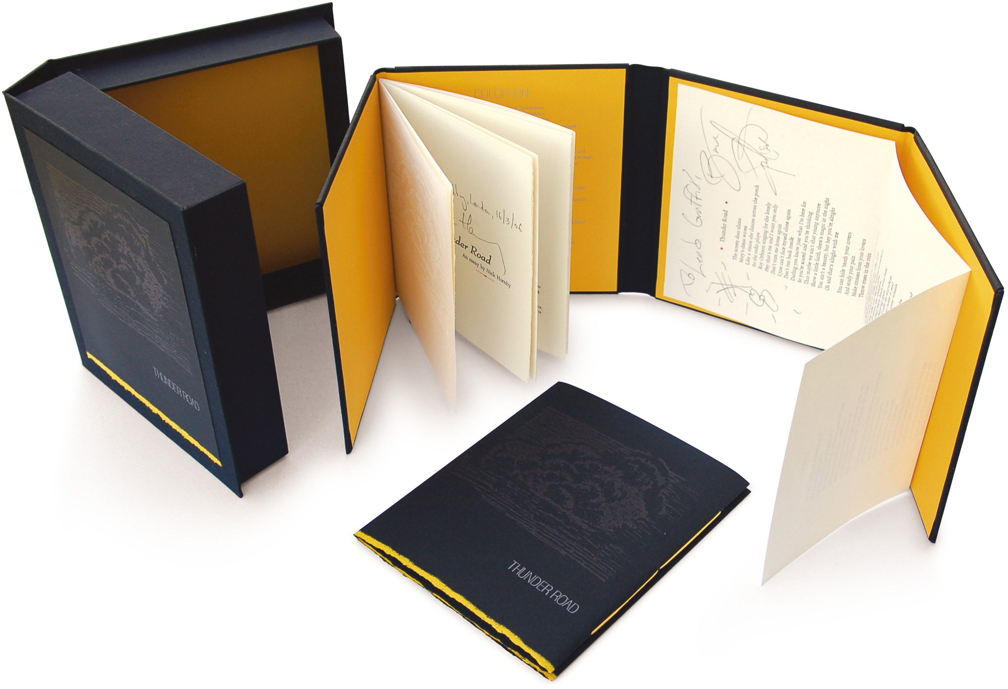
One of those strange, “fall from the sky,” kinds of projects. A friend (Mark) of a friend (Bill) of ours had been working on a project to support the British Treehouse School for autistic kids. Mark had two pieces printed: a reprint of an essay by British author Nick Hornsby on why the rock song “Thunder Road” by Bruce Springsteen was his favorite rock song ever, which had been published in McSweeney’s, and the lyrics to Bruce Springsteen’s “Thunder Road.” I think there had been a bit of a falling out amongst those involved about five years earlier, and all of this printed material had been sitting in boxes in Mark’s basement. Mark, trying to get this bad karma off his plate, calls Bill and asks, “Do you know anyone who could design a binding that would hold these two pieces. Bill responds, “Sure,” and calls his friends at Lead Graffiti. Bill mentions Bruce Springsteen’s name and says, “Would you be interested…”
We answered “Yes” without the rest of the question.
We’re playing with a way to bind two separate, already-printed pieces into a book that we can sell for some pretty serious money—for school. Every nickel goes to the school. We must donate anything involved. No problem. We are about 3 minutes into the project, and the idea is to produce a softcover book for the essay/lyrics, as well as a short-run hardcover version that we could have Springsteen sign. Mark says he has already asked about the signed version and has gotten a “No,” which is completely understandable. We’ll design the hardcover anyway, just in case. Maybe they just get sold for more money for the school.
Jill designs a woodcut of a thunderstorm to print black on black on the softcover for the parents and to print white on white on the cover of the essay for the kids. You can see from the photo above that the book has four panels. We mock up the hardcover, which gets sent over and receives a “Yes” for signing 34 copies. We’ll pull out 6 copies for the 6 parties involved (us, the printer, Mark, Bill, Bruce, & Nick) and make 6 clamshells to hold them.
The one you see above is the one Bruce Springsteen signed nicely for Lead Graffiti.
Turned out to be one of those really good “Yes” answers to a question you haven’t completely heard.